This section is primarily devoted to the exploration of various datasets using R. Students explore different datasets available in the datasets package in R, giving them exposure to real-world data. In the previous few lectures, we primarily studied various probability distributions and their properties, which are theoretical in nature. In the classroom, students explore different datasets, discuss them among themselves, and read the help files to gain detailed information about each dataset. Some examples of datasets explored by the students are provided here. Some testing problems have also been discussed.
9.2 The ChickWeight dataset
The \(\texttt{datasets}\) is a package in R, part of the base R packages. Let us get into real data set. We consider the ChickWeight data set available in R. The body weights of the chicks were measured at birth and every second day thereafter until day 20. They were also measured on day 21. There were four groups on chicks on different protein diets.
     weight           Time           Chick     Diet
 Min.   : 35.0   Min.   : 0.00   13     : 12   1:220
 1st Qu.: 63.0   1st Qu.: 4.00   9      : 12   2:120
 Median :103.0   Median :10.00   20     : 12   3:120
 Mean   :121.8   Mean   :10.72   10     : 12   4:118
 3rd Qu.:163.8   3rd Qu.:16.00   17     : 12
 Max.   :373.0   Max.   :21.00   19     : 12
                                 (Other):506
The function class is important to understand different data types. In data analysis, this function is often useful to check for the correct input type to specific functions in R.
class(ChickWeight$weight)
[1] "numeric"
class(ChickWeight$Time)
[1] "numeric"
class(ChickWeight$Chick)
[1] "ordered" "factor"
class(ChickWeight$Diet)
[1] "factor"
9.2.1 Checking for missing values
head(is.na.data.frame(ChickWeight)) # check for missing values
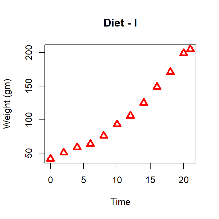
We will collect only the weight profile of the chick (coded as 1) and given the diet type 1. The following code will help us to obtain the data and plot the profile.
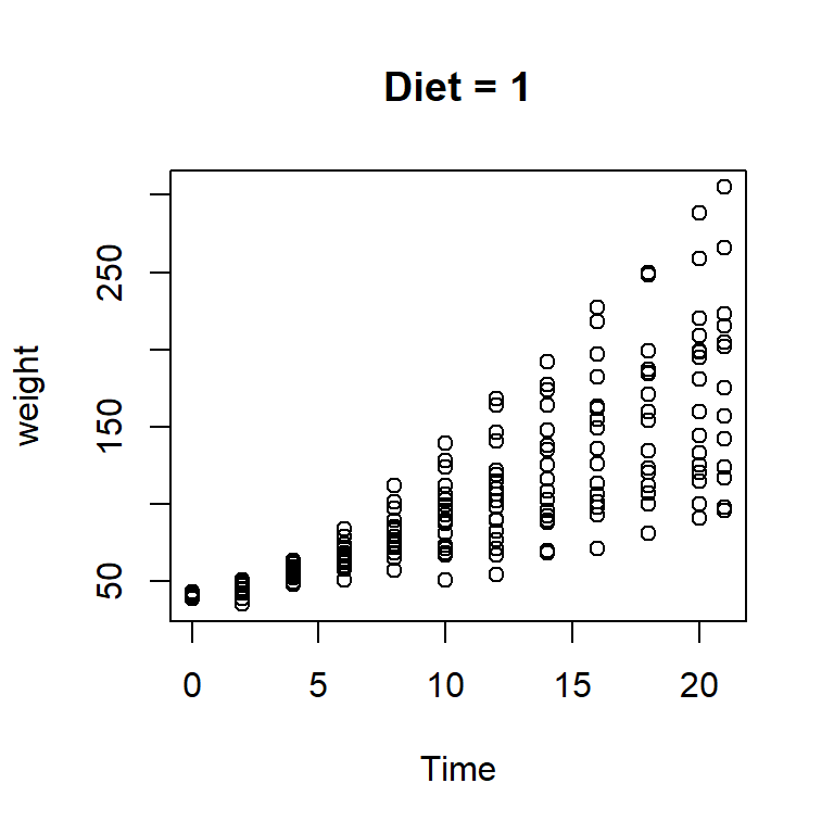
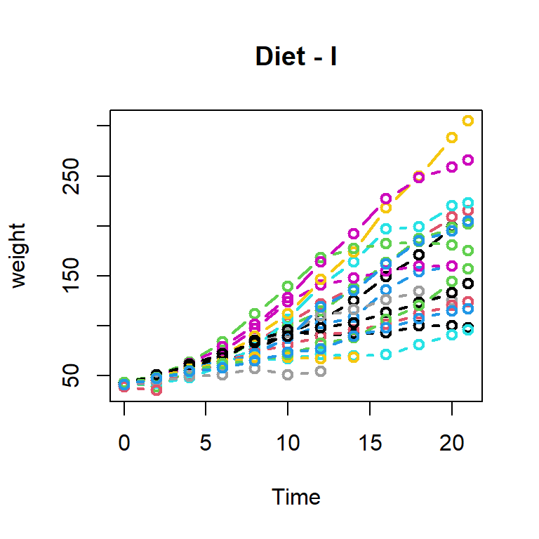
In the above plot, growth profiles of different chicks can not be identified separately. We can draw the growth profiles of each chick separately. We can have multiple growth profiles also in the same plot. We can create a single growth profile first (for chick = 1) and others can be added using the lines or points commands.
par(mfrow =c(1,1))plot(weight ~ Time, data =subset(diet_1, Chick ==1), col =1, lwd =2, type ="b", ylim =c(min(diet_1$weight), max(diet_1$weight)),main ="Diet - I")for(i in2:20){lines(weight ~ Time, data =subset(diet_1, Chick == i), col = i,lwd =2, type ="b")}
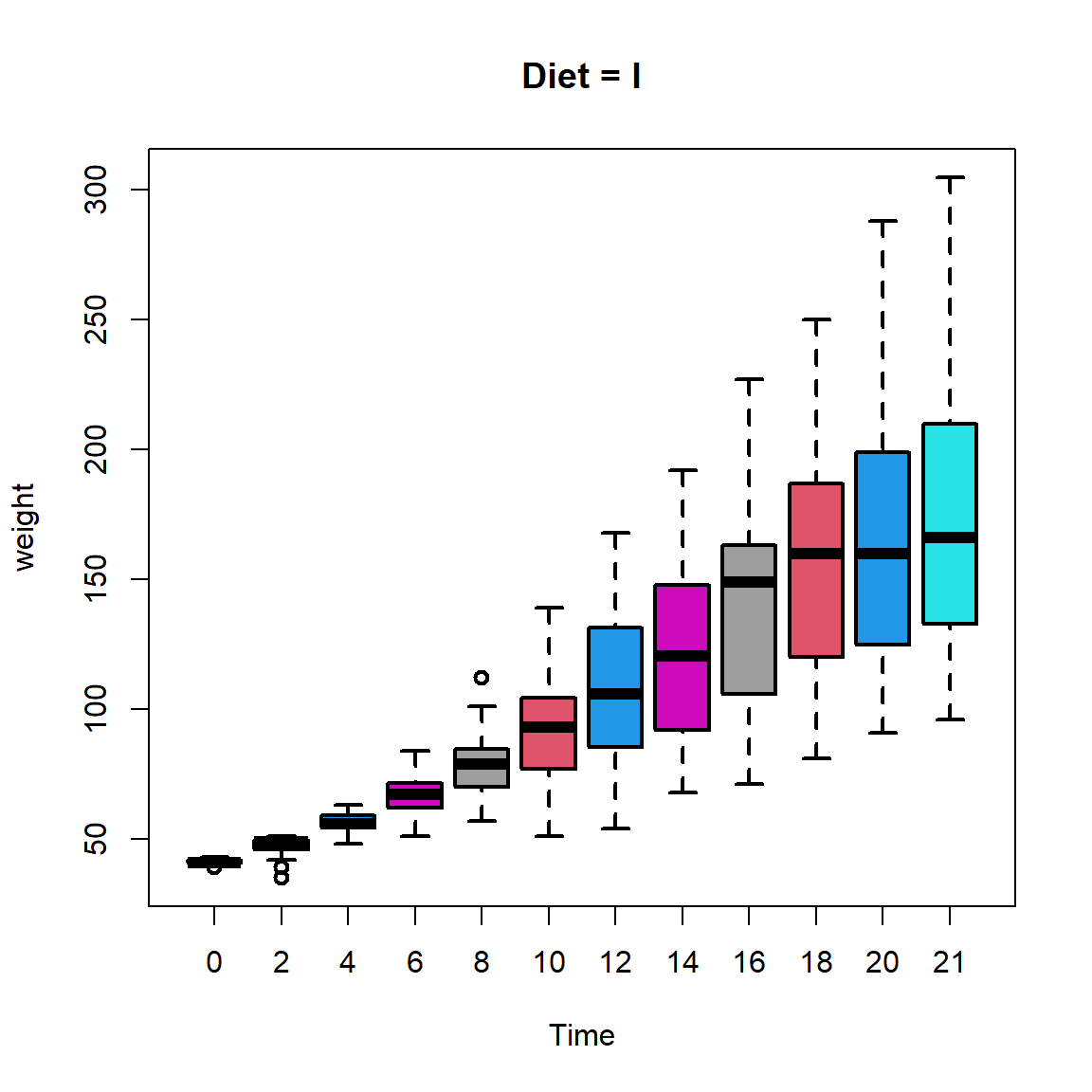
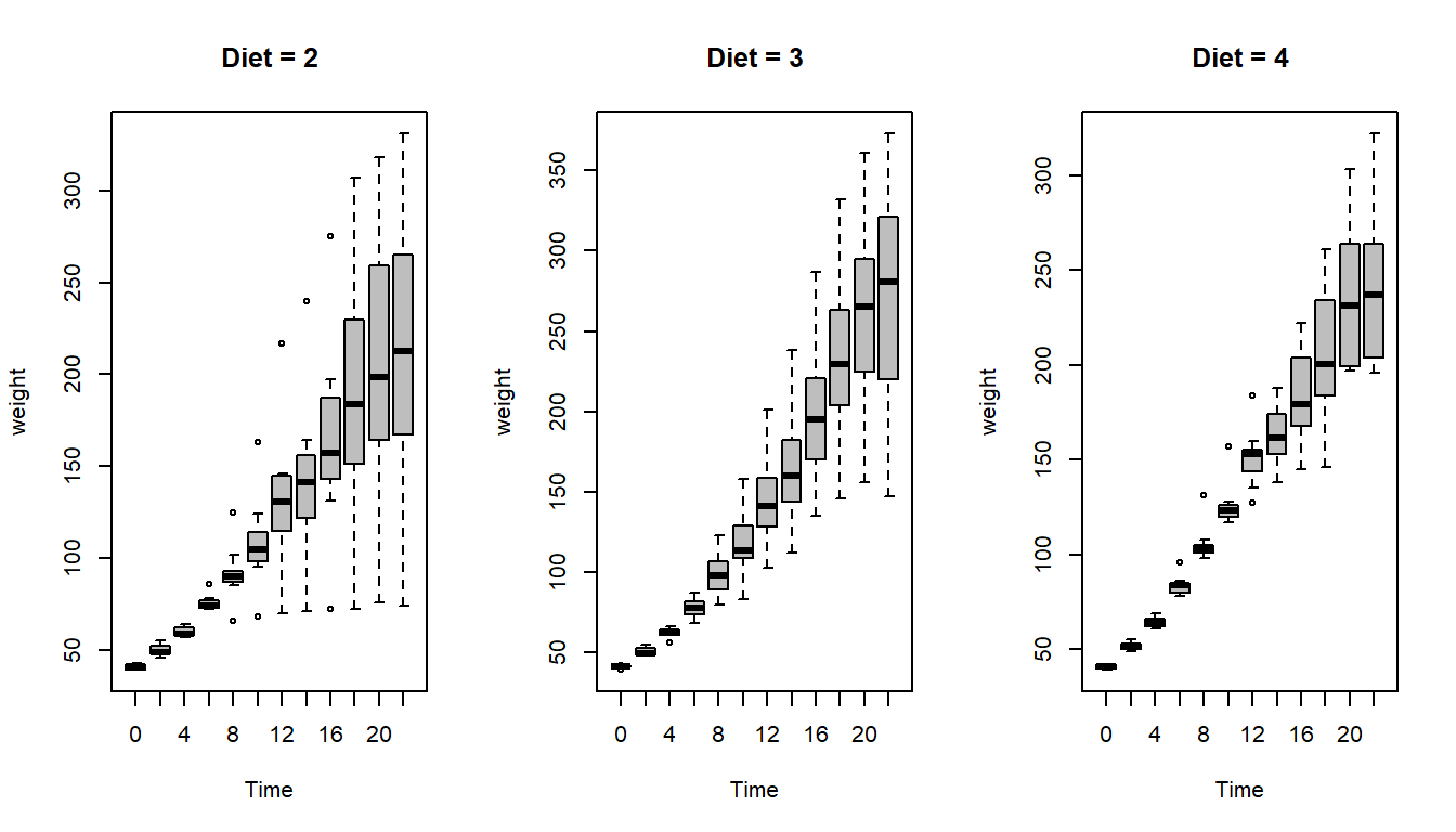
It is evident from the picture that the variance associated with measurements of weights increases as the time increases. Using the box plot, we can get a more clearer understanding about the exact shape of the spread. Using par(mfrow = c(2,2)) we can obtain four plots in a single plot window.
par(mfrow =c(1,1))boxplot(weight ~ Time, data = diet_1,main ="Diet = I", col = diet_1$Time,lwd =2)
We can execute the same task for other diet type as well.
par(mfrow =c(1,3))boxplot(weight ~ Time, data = diet_2,main ="Diet = 2", col ="grey",lwd =1)boxplot(weight ~ Time, data = diet_3,main ="Diet = 3", col ="grey",lwd =1)boxplot(weight ~ Time, data = diet_4,main ="Diet = 4", col ="grey",lwd =1)
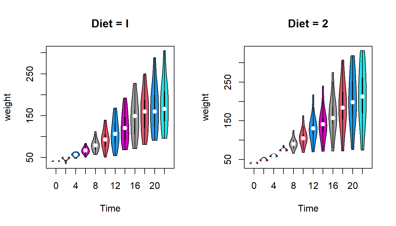
There are multiple ways to visualize the distribution of the data. violin plot is also commonly used to visualize the data distribution. This can be done by loading the package vioplot.
library(vioplot)
Loading required package: sm
Package 'sm', version 2.2-6.0: type help(sm) for summary information
Loading required package: zoo
Attaching package: 'zoo'
The following objects are masked from 'package:base':

    as.Date, as.Date.numeric
par(mfrow =c(1,2))vioplot(weight ~ Time, data = diet_1,main ="Diet = I", col = diet_1$Time,lwd =1)vioplot(weight ~ Time, data = diet_2,main ="Diet = 2", col = diet_2$Time,lwd =1)
par(mfrow =c(1,2))vioplot(weight ~ Time, data = diet_3,main ="Diet = 3", col = diet_3$Time,lwd =1)vioplot(weight ~ Time, data = diet_4,main ="Diet = 4", col = diet_4$Time,lwd =1)
Let us create a new data set with only the final weight of the chicks. The output of the subset function returns a data.frame, not a vector.
weight =c(diet_1_T21$weight, diet_2_T21$weight, diet_3_T21$weight, diet_4_T21$weight)Diet =c(rep(1, nrow(diet_1_T21)), rep(2, nrow(diet_2_T21)), rep(3, nrow(diet_3_T21)), rep(4, nrow(diet_4_T21)))Diet =as.factor(Diet) # store as factorChickWeight_T21 =data.frame(weight, Diet)
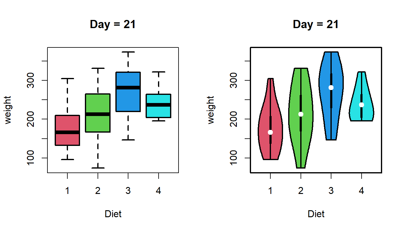
Let us make some informative plot of only the distribution of weights on 21st day for different dietary treatments.
par(mfrow =c(1,2))boxplot(weight ~ Diet, data = ChickWeight_T21,lwd =2, main ="Day = 21", col =2:5)vioplot(weight ~ Diet, data = ChickWeight_T21,lwd =2, main ="Day = 21",col =2:5)
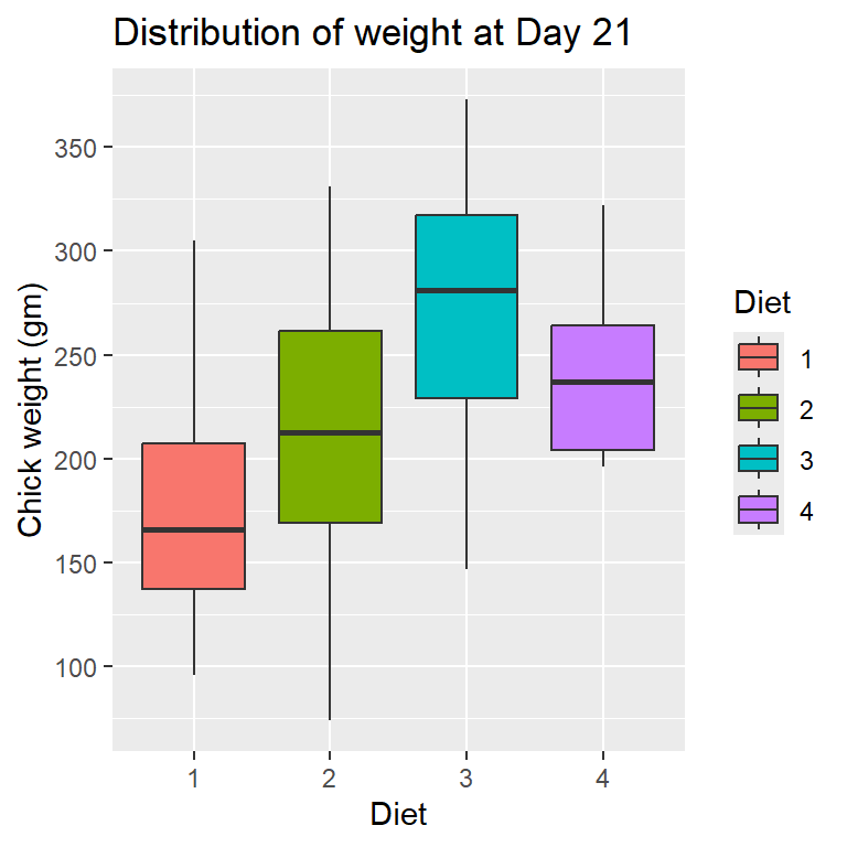
If \(\mu_{21}^{(j)}, 1\le j\le 4\) be the mean weight of the chick when considered under dietary type \(j\in\{1,2,3,4\}\), respectively. We are interested to test the following null hypothesis given by \[H_0 \colon \mu_{21}^{(1)}=\mu_{21}^{(2)}=\mu_{21}^{(3)}=\mu_{21}^{(4)}\] against the alternative \(H_1\) which specifies that if at least two means are not equal. This falls under the statistical exercise known as the analysis of variance.
out =aov(weight ~ Diet, data = ChickWeight_T21)summary(out)
            Df Sum Sq Mean Sq F value  Pr(>F)
Diet         3  57164   19055   4.655 0.00686 **
Residuals   41 167839    4094
---
Signif. codes:  0 '***' 0.001 '**' 0.01 '*' 0.05 '.' 0.1 ' ' 1
Small \(p\)-value \(0.00686\) indicates that the null hypothesis is rejected at \(5\%\) level of significance.
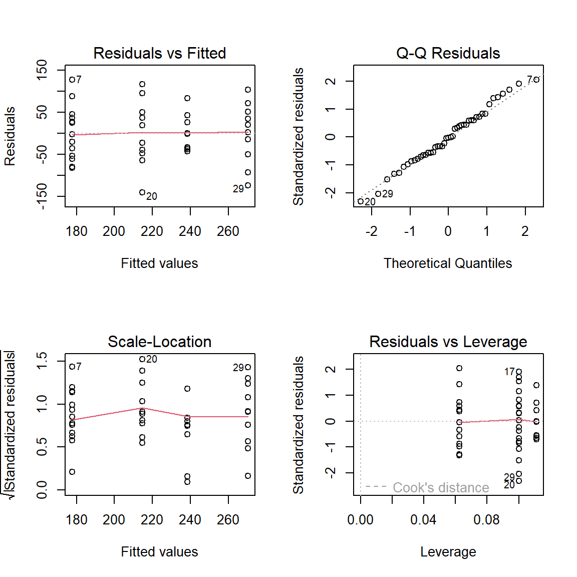
par(mfrow =c(2,2))plot(out)
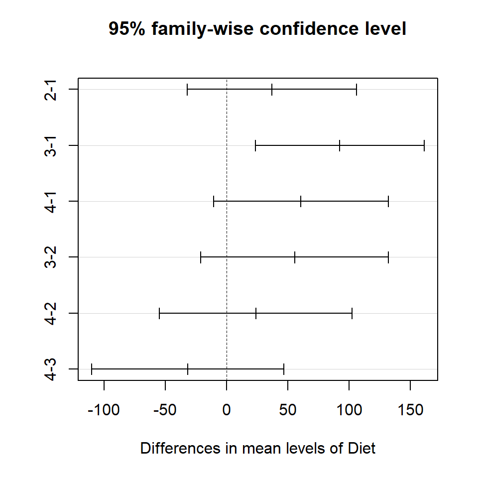
Natural question arises which two are different?
out_HSD =TukeyHSD(out, data = ChickWeight_T21)plot(out_HSD)
9.2.7 Role of assumptions
Checking for normality assumptions of the weight of chicks under each diet. We can use the function shapiro.test() to check whether the data distribution is normal. The null hypothesis is \[\begin{eqnarray}
H_0\colon &~&\mbox{ the data are normally distributed}\\
H_1\colon &~& \mbox{ the data are not normally distributed}
\end{eqnarray}\]
shapiro.test(ChickWeight_T21$weight[Diet ==1])
    Shapiro-Wilk normality test

data:  ChickWeight_T21$weight[Diet == 1]
W = 0.95602, p-value = 0.5905
shapiro.test(ChickWeight_T21$weight[Diet ==2])
    Shapiro-Wilk normality test

data:  ChickWeight_T21$weight[Diet == 2]
W = 0.97725, p-value = 0.9488
shapiro.test(ChickWeight_T21$weight[Diet ==3])
    Shapiro-Wilk normality test

data:  ChickWeight_T21$weight[Diet == 3]
W = 0.97045, p-value = 0.895
shapiro.test(ChickWeight_T21$weight[Diet ==4])
    Shapiro-Wilk normality test

data:  ChickWeight_T21$weight[Diet == 4]
W = 0.88694, p-value = 0.1855
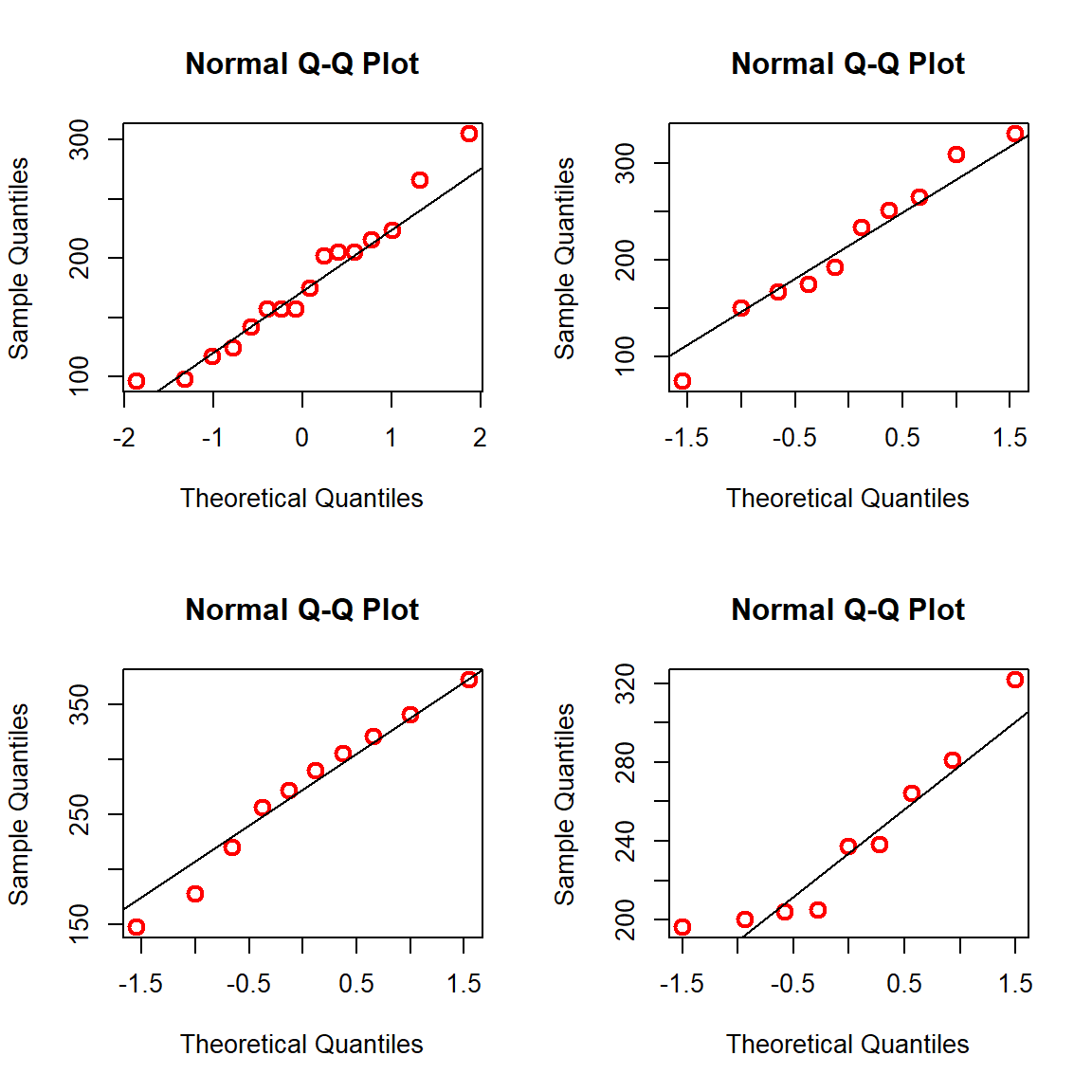
A large \(p\) value indicates that the data are normally distributed. Here the null hypothesis is that the data distribution is normal. Therefore, a large \(p\)-value indicates the acceptance of the null hypothesis. There are other visual representations to check the normality assumption.
par(mfrow =c(2,2))qqnorm(ChickWeight_T21$weight[Diet ==1], col ="red", cex =1.3, lwd =2)qqline(ChickWeight_T21$weight[Diet ==1])qqnorm(ChickWeight_T21$weight[Diet ==2], col ="red", cex =1.3, lwd =2)qqline(ChickWeight_T21$weight[Diet ==2])qqnorm(ChickWeight_T21$weight[Diet ==3], col ="red", cex =1.3, lwd =2)qqline(ChickWeight_T21$weight[Diet ==3])qqnorm(ChickWeight_T21$weight[Diet ==4], col ="red", cex =1.3, lwd =2)qqline(ChickWeight_T21$weight[Diet ==4])
9.2.8 Some more options of boxplot using ggplot2
The package ggplot2 offers several options for beautiful graphics using R. In the following, we demonstrate how to draw the side by side boxplot of continuous variable with respect to a factor variable in the data.
library(ggplot2)ggplot2::ggplot(data = ChickWeight_T21,aes(Diet, weight, fill = Diet)) +geom_boxplot() +scale_y_continuous("Chick weight (gm)",breaks =seq(50, 400, by =50)) +labs(title ="Distribution of weight at Day 21", x ="Diet")
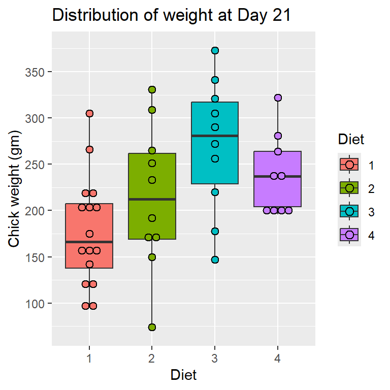
library(ggplot2)ggplot2::ggplot(data = ChickWeight_T21,aes(Diet, weight, fill = Diet)) +geom_boxplot() +scale_y_continuous("Chick weight (gm)",breaks =seq(50, 400, by =50)) +labs(title ="Distribution of weight at Day 21", x ="Diet") +geom_dotplot(binaxis='y', stackdir='center', dotsize=0.8)
Bin width defaults to 1/30 of the range of the data. Pick better value with
`binwidth`.
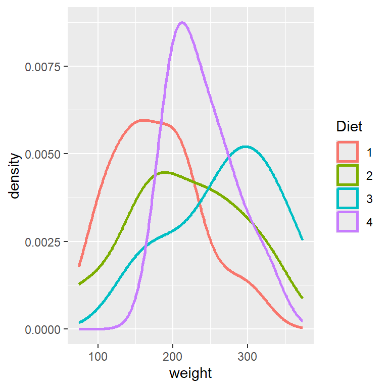
To visualize the shape of the distribution with respect to different categories, we can also use the density plot.
library(ggplot2)ggplot(ChickWeight_T21, aes(x = weight, color = Diet)) +geom_density(linewidth =1)
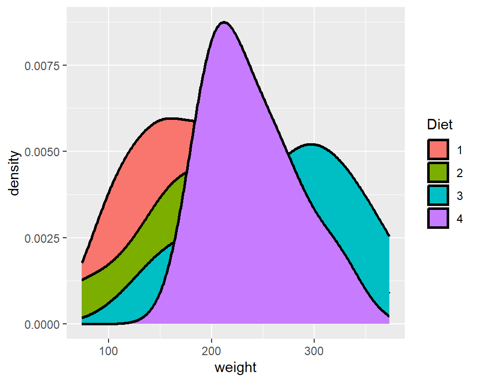
We can have vertical lines at the mean value of each diet category. First we need to compute the means of each group.
    F test to compare two variances

data:  ChickWeight_T21$weight[Diet == 1] and ChickWeight_T21$weight[Diet == 2]
F = 0.56439, num df = 15, denom df = 9, p-value = 0.3146
alternative hypothesis: true ratio of variances is not equal to 1
95 percent confidence interval:
 0.1497316 1.7624337
sample estimates:
ratio of variances
         0.5643921
The Levene Test (Levene 1960) can be used to check for the equality of variances for multiple groups.
library(car)
Loading required package: carData
car::leveneTest(weight ~ Diet, data = ChickWeight_T21, center = mean)
Levene's Test for Homogeneity of Variance (center = mean)
      Df F value Pr(>F)
group  3  1.2412 0.3072
      41
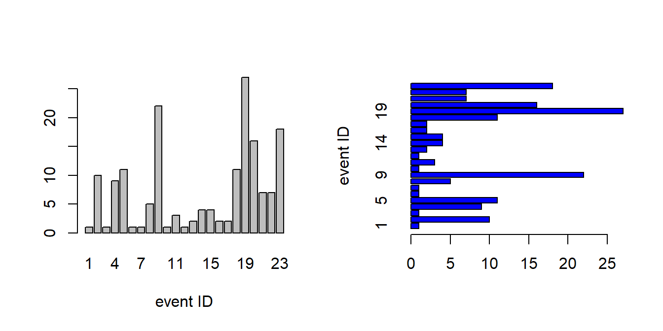
9.3 The Joyner–Boore Attenuation Data
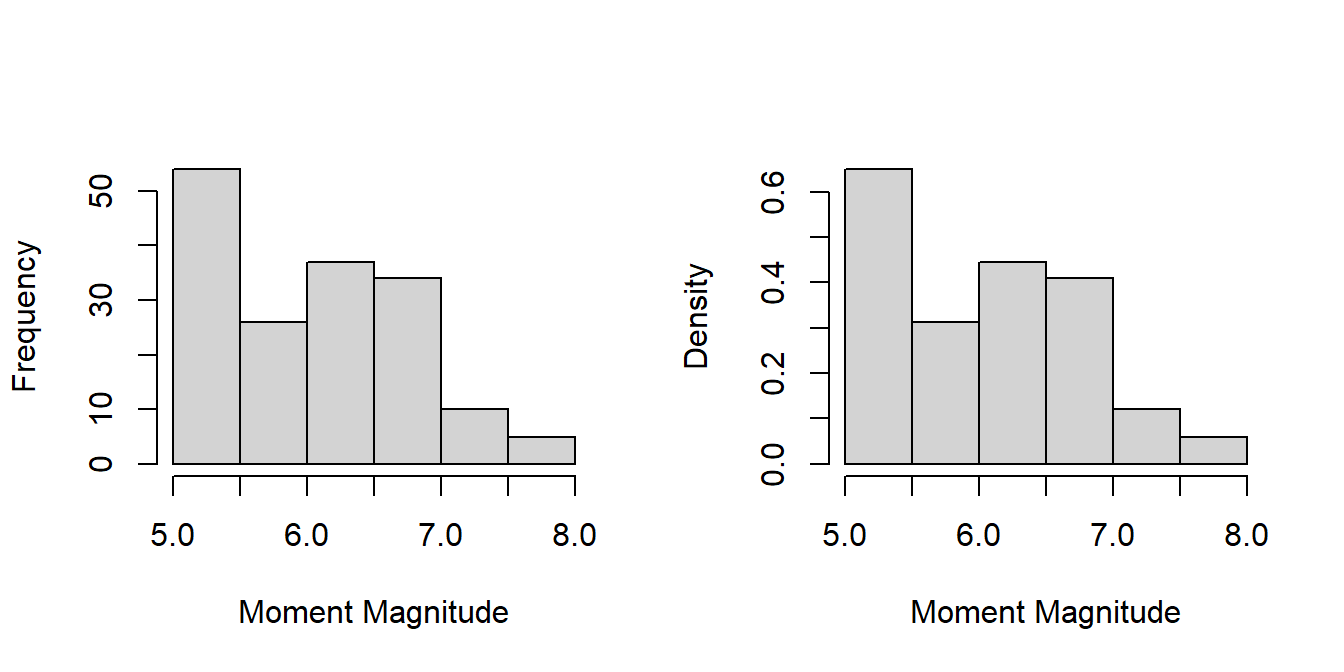
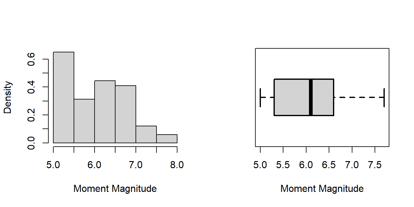
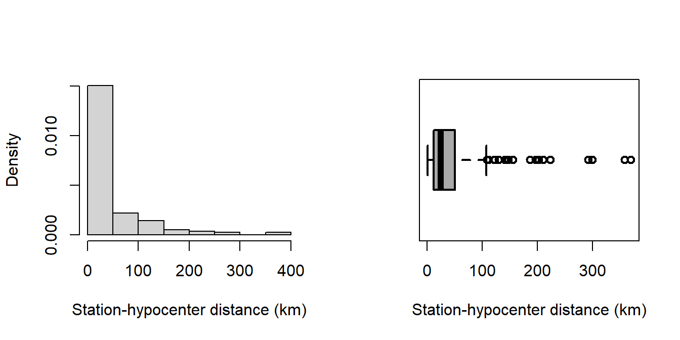
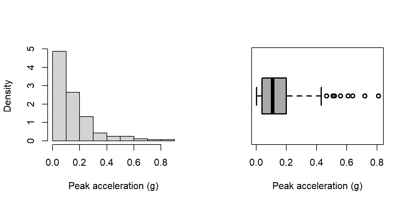
attenu data set, known as The Joyner–Boore Attenuation Data, is available in the datasets package in R. This data gives peak accelerations measured at various observation stations for 23 earthquakes in California. The data have been used by various workers to estimate the attenuating affect of distance on ground acceleration. Type help("attenu") in the console for more information and also interested readers can check out the article by (Boore and Joyner 1982).
The function complete.cases() returns FALSE if there is any row with at least one variable information is missing. Also try using !complete.cases().
9.4.1 Basic data exploration
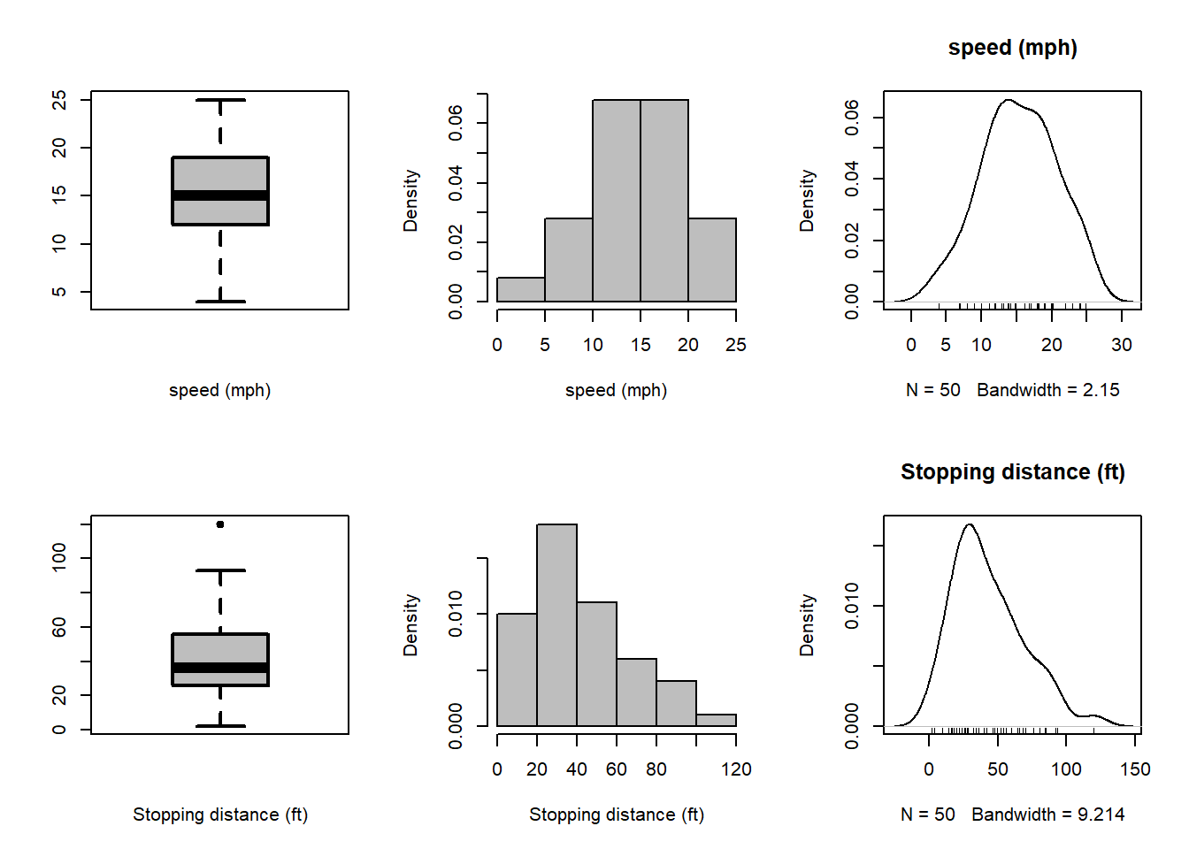
Looking at individual variables is always suggested as a part of the EDA.
par(mfrow=c(2,3))boxplot(cars$speed, col ="grey", lwd =2,xlab ="speed (mph)")hist(cars$speed, probability =TRUE, col ="grey", xlab ="speed (mph)", main ="")plot(density(cars$speed), main ="speed (mph)")rug(jitter(cars$speed))boxplot(cars$dist, col ="grey", lwd =2, xlab ="Stopping distance (ft)")hist(cars$dist, probability =TRUE, col ="grey", xlab ="Stopping distance (ft)", main ="")plot(density(cars$dist), main ="Stopping distance (ft)")rug(jitter(cars$dist))
We can use the shapiro.test() function to test whether the data is normally distributed.
shapiro.test(cars$speed)
    Shapiro-Wilk normality test

data:  cars$speed
W = 0.97765, p-value = 0.4576
shapiro.test(cars$dist)
    Shapiro-Wilk normality test

data:  cars$dist
W = 0.95144, p-value = 0.0391
From the output, at 5% level of significance, we reject the null hypothesis for the variable Stopping distance (ft) that it is normally distributed using Shapiro Wilks test Royston (1995). However, it is important to note that the \(p\)-value is 0.0391, therefore, we can not reject it at \(1\%\) level of significance.
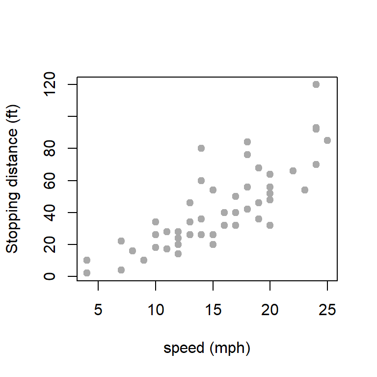
A natural question arises how Stopping distance (ft) varies as a function of speed (mph). First let us explore the scatter plot between these two variables.
To explore some kind of linear relationship between Stopping distance and Speed, we first check whether there is significant correlation between them. Therefore, we test the following hypothesis for the correlation coefficient \(\rho = \mbox{Corr}(\mbox{dist, speed})\)
\[H_0\colon \rho = 0~~~~\mbox{against}~~~~H_1\colon \rho\ne 0.\] The test is performed using the function cor.test().
cor(cars$speed, cars$dist)
[1] 0.8068949
cor.test(cars$speed, cars$dist)
    Pearson's product-moment correlation

data:  cars$speed and cars$dist
t = 9.464, df = 48, p-value = 1.49e-12
alternative hypothesis: true correlation is not equal to 0
95 percent confidence interval:
 0.6816422 0.8862036
sample estimates:
      cor
0.8068949
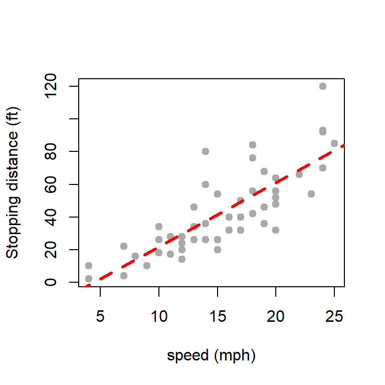
fit =lm(dist ~ speed, data = cars)summary(fit)
Call:
lm(formula = dist ~ speed, data = cars)
Residuals:
Min 1Q Median 3Q Max
-29.069 -9.525 -2.272 9.215 43.201
Coefficients:
Estimate Std. Error t value Pr(>|t|)
(Intercept) -17.5791 6.7584 -2.601 0.0123 *
speed 3.9324 0.4155 9.464 1.49e-12 ***
---
Signif. codes: 0 '***' 0.001 '**' 0.01 '*' 0.05 '.' 0.1 ' ' 1
Residual standard error: 15.38 on 48 degrees of freedom
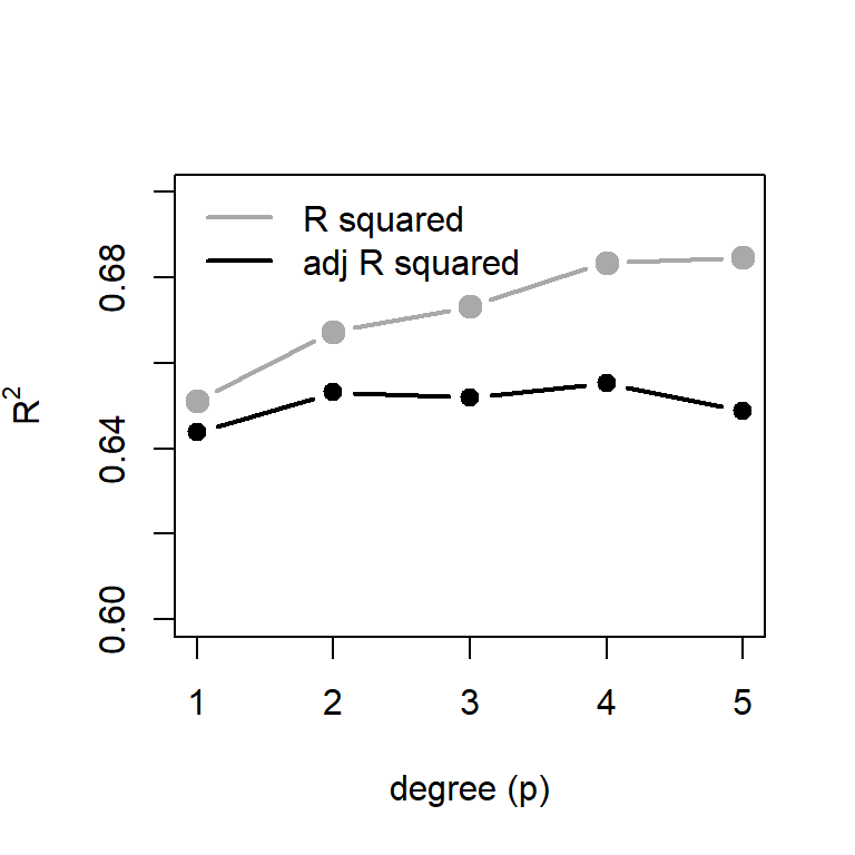
Multiple R-squared: 0.6511, Adjusted R-squared: 0.6438
F-statistic: 89.57 on 1 and 48 DF, p-value: 1.49e-12
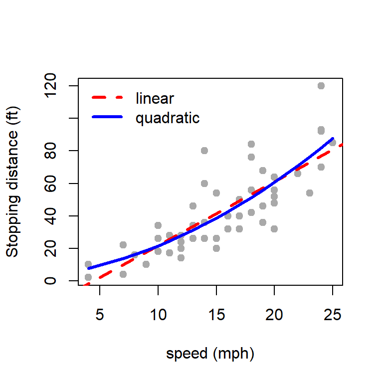
plot(cars$speed, cars$dist, type ="p", pch =19,col ="darkgrey", ylab ="Stopping distance (ft)",xlab ="speed (mph)")abline(fit, col ="red", lwd =3, lty =2)
Fitting of the simple linear regression model.
beta-coefficient of speed is statistically significant, which means the stopping distance depends on speed.
The Multiple R-squared = 0.6511, which means that approximately \(65\%\) of the variability in dist can be explained by the the variable speed through a linear function.
coefficients(fit)
(Intercept)       speed
 -17.579095    3.932409
In this problem, we have assumed a linear relationship between the dist and speed. However, we do not know whether the linearity assumption is a legitimate choice to approximate the true relationship (which we do not know). We do some diagnostic tests to check whether the linearity assumption is tenable.
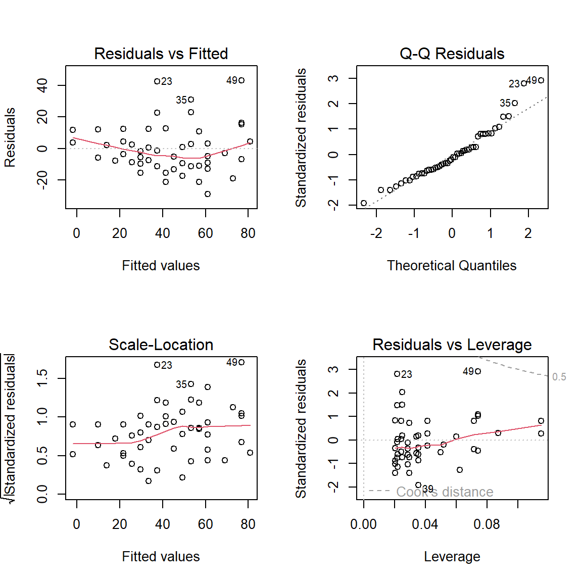
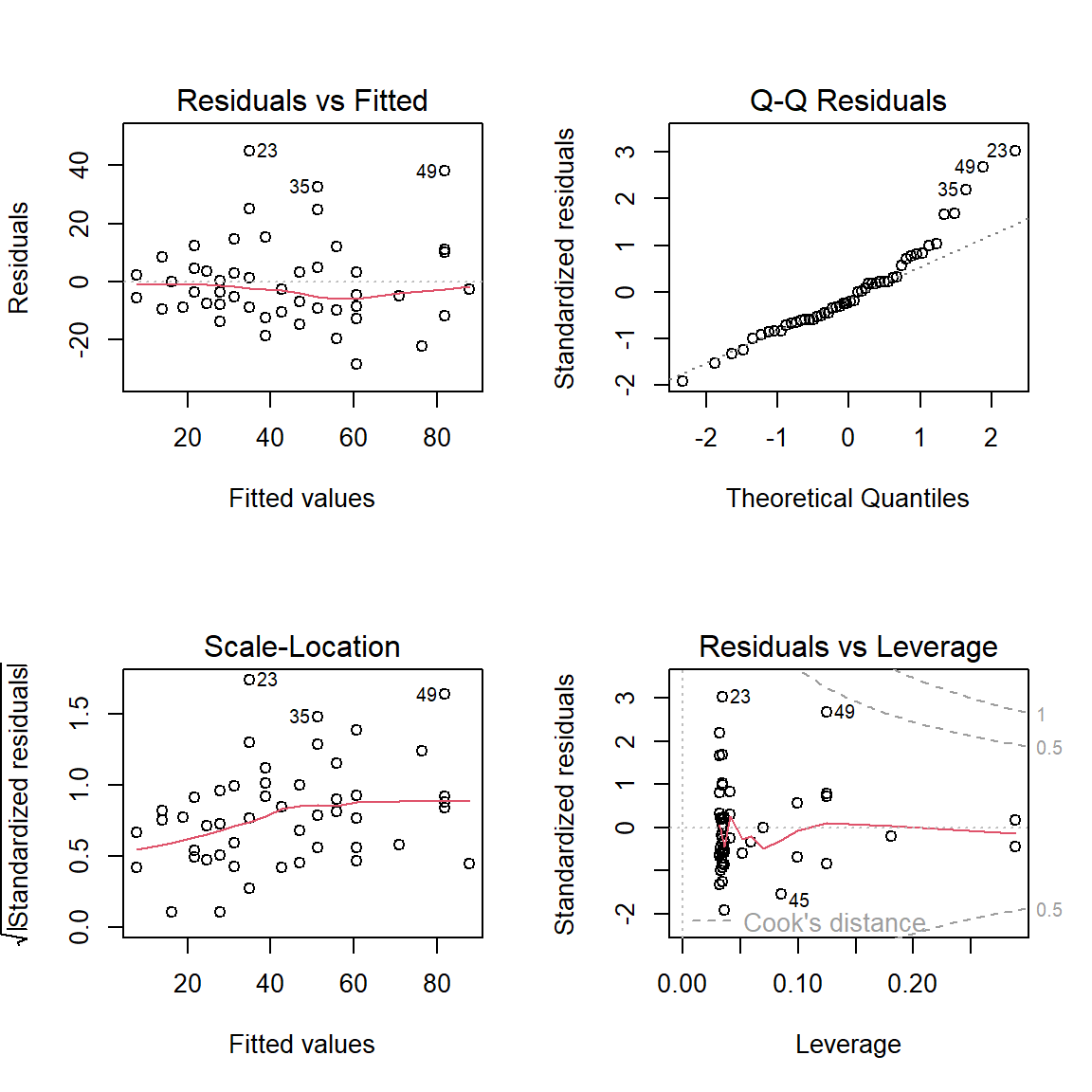
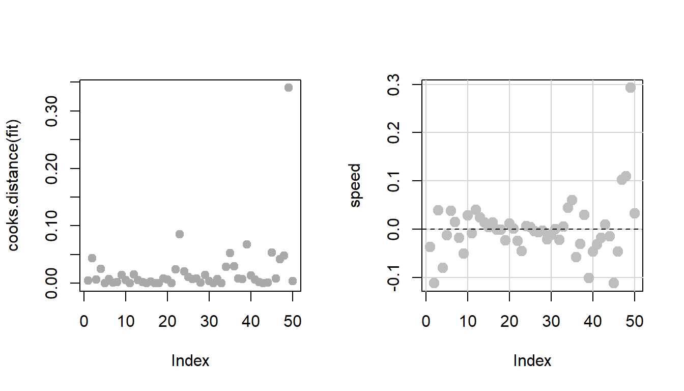
par(mfrow =c(2,2))plot(fit)
Regression diagnostic plot for the simple linear regression. The top panel indicates the existence of outlying observations, particularly the row numbers 23, 35 and 49 have been identified as the outlying observations.
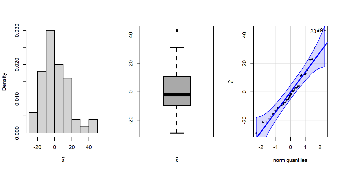
par(mfrow =c(1,3))error =residuals(fit) # residualshist(error, probability =TRUE, xlab =expression(widehat(epsilon)),main ="")boxplot(error, xlab =expression(widehat(epsilon)),lwd =2, col ="darkgrey")library(car)qqPlot(error, ylab =expression(widehat(epsilon)))
The package has been used to draw the quantile plot the plots empirical quantiles of a variable against theoretical quantiles of a comparison distribution (here it is normal)(Fox 2016).
[1] 49 23
There may be existence of nonlinearity.
Regression diagnostics gave some outlying observations.
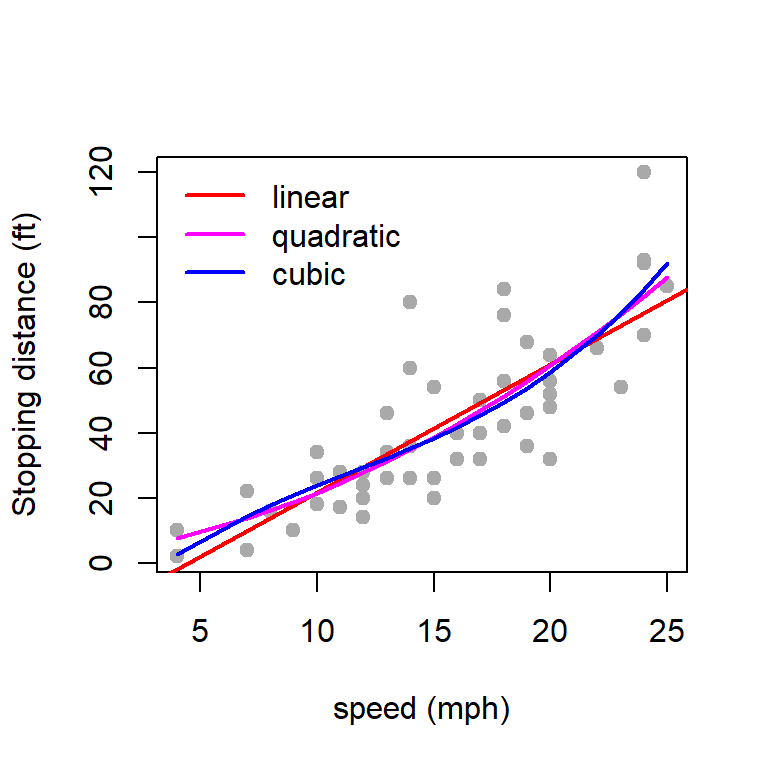
You can possibly remove those outliers and perform a linear regression, or you can go for a quadratic regression.
9.4.2 Quadratic fitting
We are fitting the following quadratic polynomial equation
\[\mbox{dist} = \beta_0 + \beta_1 \times \mbox{speed} + \beta_2 \times \mbox{speed}^2.\] Using the following R Codes, we can obtain the least squares estimate of the coefficients \(\beta_0, \beta_1,\beta_2\). The symbol \(\texttt{I}(\cdot)\) is used as wrapper for polynomial terms to create the formula for the lm() function.
par(mfrow =c(1,1))fit2 =lm(dist ~ speed +I(speed^2), data = cars)summary(fit2)
Call:
lm(formula = dist ~ speed + I(speed^2), data = cars)

Residuals:
    Min      1Q  Median      3Q     Max
-28.720  -9.184  -3.188   4.628  45.152

Coefficients:
            Estimate Std. Error t value Pr(>|t|)
(Intercept)  2.47014   14.81716   0.167    0.868
speed        0.91329    2.03422   0.449    0.656
I(speed^2)   0.09996    0.06597   1.515    0.136

Residual standard error: 15.18 on 47 degrees of freedom
Multiple R-squared:  0.6673,    Adjusted R-squared:  0.6532
F-statistic: 47.14 on 2 and 47 DF,  p-value: 5.852e-12
9.4.3 Regression diagnostic for quadratic regression
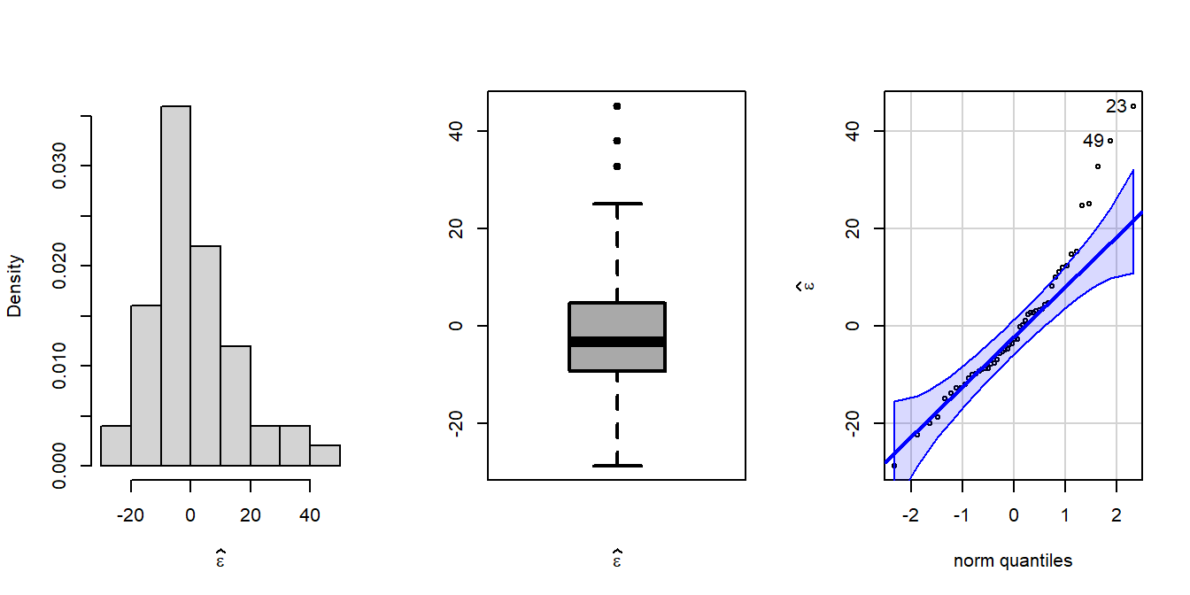
par(mfrow =c(1,3))error =residuals(fit2)hist(error, probability =TRUE, xlab =expression(widehat(epsilon)),main ="")boxplot(error, xlab =expression(widehat(epsilon)),lwd =2, col ="darkgrey")library(car)qqPlot(error, ylab =expression(widehat(epsilon)))
[1] 23 49
We can obtain the diagnostic plot using the plot() function.
par(mfrow =c(2,2))plot(fit2)
Regression diagnostc for the quadratic function fitting. In fact, the Q-Q Residuals plot gave more number of outliers and to some extent we get a feeling that quadratic regression might not be a good option as the there is deviance from the normality of residuals. In addition, the residuals versus fitted values plot provides a slight indication of heteroschedasticity.
There seem to be slight improvement using a quadratic equation than a linear equation. However, it can be statistically check whether this increment is statistically significant or not. The function anova() is used to compare the performance of fitting exercises using two different functions.
anova(fit, fit2)
Analysis of Variance Table

Model 1: dist ~ speed
Model 2: dist ~ speed + I(speed^2)
  Res.Df   RSS Df Sum of Sq     F Pr(>F)
1     48 11354
2     47 10825  1    528.81 2.296 0.1364
As per the qqPlot() function from the car package, two data points (row number 23 and 49) have been identified as outliers leading to deviation from the normality of the residuals. Let us remove them.
fit_new =lm(dist ~ speed, data = cars[-c(23, 35, 49),])summary(fit_new)
Call:
lm(formula = dist ~ speed, data = cars[-c(23, 35, 49), ])

Residuals:
    Min      1Q  Median      3Q     Max
-25.032  -7.686  -1.032   6.576  26.185

Coefficients:
            Estimate Std. Error t value Pr(>|t|)
(Intercept) -15.1371     5.3053  -2.853  0.00652 **
speed         3.6085     0.3302  10.928    3e-14 ***
---
Signif. codes:  0 '***' 0.001 '**' 0.01 '*' 0.05 '.' 0.1 ' ' 1

Residual standard error: 11.84 on 45 degrees of freedom
Multiple R-squared:  0.7263,    Adjusted R-squared:  0.7202
F-statistic: 119.4 on 1 and 45 DF,  p-value: 3.003e-14
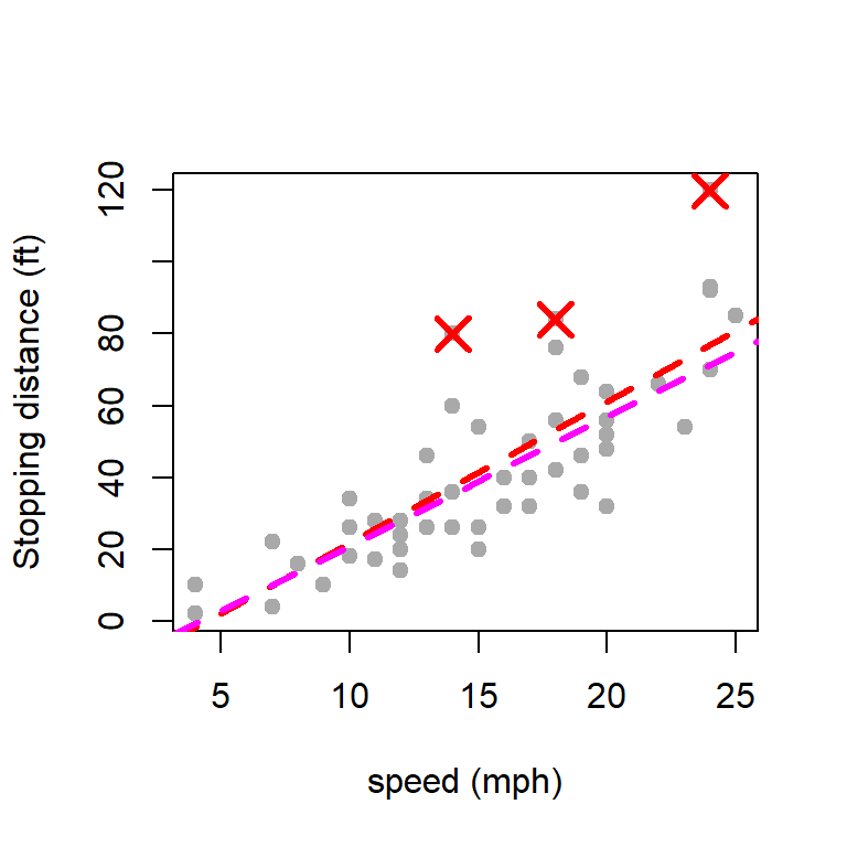
par(mfrow =c(1,1))plot(cars$speed, cars$dist, type ="p", pch =19,col ="darkgrey", ylab ="Stopping distance (ft)",xlab ="speed (mph)")abline(fit, col ="red", lwd =3, lty =2)abline(fit_new, col ="magenta", lwd =3, lty =2)points(cars[c(23,35,49),], col ="red", cex =2,lwd =3, pch =4)
The dotted magenta line indicates the fitted linear regression line after removing the three outlying observations as identified by the regression diagnostics.
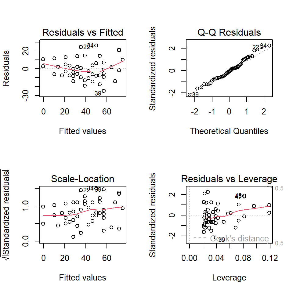
par(mfrow =c(2,2))plot(fit_new)
Regression diagnostic for the linear regression model after removing three outlying observations.
Although after removing the designated outliers from the regression diagnostic plots, we obtained a significant improvement in the \(R^2\) values (approx \(75\%\)), however, the diagnostic plot of the new regression fit, gives stronger evidence towards the existence of nonlinear relationship.
fit3 =lm(dist ~ speed +I(speed^2) +I(speed^3) , data = cars)summary(fit3)
Call:
lm(formula = dist ~ speed + I(speed^2) + I(speed^3), data = cars)

Residuals:
    Min      1Q  Median      3Q     Max
-26.670  -9.601  -2.231   7.075  44.691

Coefficients:
             Estimate Std. Error t value Pr(>|t|)
(Intercept) -19.50505   28.40530  -0.687    0.496
speed         6.80111    6.80113   1.000    0.323
I(speed^2)   -0.34966    0.49988  -0.699    0.488
I(speed^3)    0.01025    0.01130   0.907    0.369

Residual standard error: 15.2 on 46 degrees of freedom
Multiple R-squared:  0.6732,    Adjusted R-squared:  0.6519
F-statistic: 31.58 on 3 and 46 DF,  p-value: 3.074e-11
Y = cars$distbeta_star = (solve(t(X)%*%X))%*%t(X)%*%Yprint(beta_star)
           [,1]
[1,] -17.579095
[2,]   3.932409
9.6 Questions
Using the airquality dataset, answer the following descriptive statistics questions:
Using help(airquality) command obtain basic description of the data and also check the source of the data set.
Calculate the mean, median, standard deviation, and range of the Ozone variable.
How many missing values are there in the Ozone variable?
Draw boxplot and histograms of each variable present in the airquality data. Using boxplot in R identify the outliers.
Calculate the average Temp for each month (May through September).
Which month recorded the highest average Temp?
What is the correlation between Ozone and Solar.R? Interpret the result.
Create a scatter plot of Wind vs. Temp. Does the plot suggest a relationship?
Plot a histogram of the Wind variable. Comment on the shape of the distribution.
What is the interquartile range (IQR) of Wind?
Identify the percentage of rows with missing values in the dataset.
Provide one strategy to handle missing values in the Ozone variable and explain its implications.
The rivers dataset contains the lengths (in miles) of 141 major rivers in North America.
What is the mean, median, and standard deviation of the river lengths?
What is the range (minimum and maximum) of the river lengths?
Create a histogram of the river lengths. What is the shape of the distribution (e.g., symmetric, skewed)?
How many rivers are longer than 1,000 miles?
Create a boxplot of the river lengths. Are there any outliers?
What is the interquartile range (IQR) of the river lengths?
What percentage of rivers fall within one standard deviation of the mean?
Apply a log transformation to the river lengths. How does the histogram of the transformed data compare to the original?
Why might a log transformation be useful for this dataset?
What is the mean length of the 10 shortest rivers?
What is the mean length of the 10 longest rivers?
How does the variability (standard deviation) compare between the shortest and longest rivers?
Create a density plot of the river lengths. How does it compare to the histogram?
Overlay a rug plot on the histogram. Does it provide additional insights about the data distribution?
Compare the distribution of river lengths to a normal distribution using a Q-Q plot. What do you observe?
Test the normality of the river length data using the Shapiro-Wilk test. What is the result?
Identify any regions or patterns in the data that suggest natural groupings or clusters of river lengths.
The EuStockMarkets dataset contains daily closing prices of major European stock indices from 1991 to 1998.
What are the mean, median, standard deviation, and range of closing prices for each stock index (DAX, SMI, CAC, and FTSE)?
Which stock index has the highest average closing price over the entire dataset?
What is the minimum and maximum closing price for each index?
Create histograms for the closing prices of each stock index.
Which indices show skewed distributions?
Plot density plots for the indices. Do they suggest unimodal or multimodal distributions?
Use boxplots to compare the distributions of the four stock indices. Are there any outliers?
(Temporal trends) Plot the time series of the closing prices for each index. What trends do you observe?
Identify the periods of significant increases or decreases for each stock index.
Which index shows the highest volatility (largest fluctuations) over time?
(Correlation analysis) Compute the pairwise correlations between the indices. Which pair of indices has the strongest correlation?
Create a scatterplot matrix of the indices. Do the relationships appear linear?
Conduct a hypothesis test to determine if the correlation between DAX and CAC is significantly different from zero.
(Volatility) Calculate the daily returns (\((P_t - P_{t-1})/P_{t-1})\) for each index. Which index has the highest average daily return?
Plot the time series of daily returns. Which index shows the most frequent large spikes?
Identify the days with the largest positive and negative returns for each index.
Use Q-Q plots to assess whether the closing prices of each index follow a normal distribution. Which indices deviate most from normality?
Suggest real-world economic events during the dataset period (1991–1998) that might have influenced the trends in these indices.
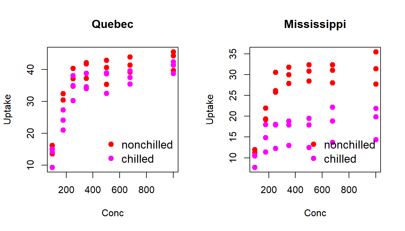
The CO2 dataset contains data on carbon dioxide uptake in grass plants under varying environmental conditions. The CO2 uptake of six plants from Quebec and six plants from Mississippi was measured at several levels of ambient CO2 concentration. Half the plants of each type were chilled overnight before the experiment was conducted.
What is the mean, median, standard deviation, and range of the variable uptake?
What is the mean and standard deviation of conc across all plants?
Which plant has the highest carbon dioxide uptake (uptake)?
(Comparison among groups) What is the average uptake for each Type of plant (Quebec and Mississippi)?
Compare the mean and median uptake for plants under different Treatment conditions (nonchilled vs chilled).
Calculate the mean uptake for each combination of Type and Treatment.
Which group has the highest mean uptake?
(Understanding individual distributions) Create histograms of uptake for the two Type groups (Quebec and Mississippi).
How do the distributions differ?
Plot a boxplot of uptake by Treatment. Are there any outliers?
Create density plots of uptake for the two Type groups. What do you observe about their shapes?
Create a scatter plot of uptake vs. conc. What kind of relationship do you observe?
Fit a linear model of uptake as a function of conc. What does the slope of the line indicate?
Does the relationship between uptake and conc differ across Type or Treatment? Visualize and explain.
(Advanced Visualizations) Create a faceted scatterplot of uptake vs. conc by Type and Treatment. What patterns emerge?
Create a heatmap of the average uptake for each combination of Type, Treatment, and conc ranges. What does this visualization reveal?
Plot boxplots of uptake grouped by individual Plant. Which plants have the highest median and variability?
(Transformation) Apply a log transformation to uptake. How does the distribution change?
Group conc into intervals (e.g., 0–200, 201–400, etc.) and calculate the average uptake for each interval. What trend do you observe?
Boore, D. M., and W. B. Joyner. 1982. “The Empirical Prediction of Ground Motion.”Bulletin of the Seismological Society of America 72: S269–68.
Ezekiel, Mordecai. 1930. Methods of Correlation Analysis. Wiley.
Fox, John. 2016. Applied Regression Analysis and Generalized Linear Models. Third. Sage.
Levene, Howard. 1960. “Robust Tests for Equality of Variances.” In Contributions to Probability and Statistics: Essays in Honor of Harold Hotelling, edited by Ingram Olkin, 278–92. Stanford University Press.
Royston, Patrick. 1982. “An Extension of Shapiro and Wilk’s \(W\) Test for Normality to Large Samples.”Applied Statistics 31: 115–24. https://doi.org/10.2307/2347973.
———. 1995. “Remark AS R94: A Remark on Algorithm AS 181: The \(W\) Test for Normality.”Applied Statistics 44: 547–51. https://doi.org/10.2307/2986146.