glycol = c(0.00, 5.09, 11.3, 15.47, 20.94, 30.97, 31.22,
           36.62, 42.76, 48, 49.34, 51.36, 56.36, 59.05)
freezing_point = c(273.15, 267.46, 258.5, 251.72, 241.58,
                   225.28, 225.49, 228.03, 229.89, 230.5,
                   230.54, 230.37, 232.12, 234.62)
data = data.frame(glycol, freezing_point)10 Regression Models and Interdisciplinary Applications
10.1 Least squares method
At the outset of this chapter, I wish to share a note of pedagogical intent, particularly for my fellow teachers. Linear regression is often introduced in classrooms through the use of built-in functions and statistical packages in R or other software. However, the demonstrations in this book deliberately avoid reliance on such packages. Instead, we focus on applying the formulas derived by students themselves during classroom instruction.
The core idea is to bridge the gap between students’ immediate mathematical understanding and real-world datasets. As a result, many of the formulas in this chapter are expressed directly using the design matrix, reflecting the theoretical framework students have worked with in class.
This approach was developed and implemented for the MDM students of the Machine Learning and Artificial Intelligence minor at ICT, Mumbai (batch 2023–2027). In practice, I observed that when students used R in the lab, they tended to memorize functions such as \(\texttt{lm()}\) and \(\texttt{summary()}\) without grasping how these relate to the theory learned in class. R became, for them, a disconnected tool—separate from the mathematical foundation.
Therefore, throughout this chapter, we rely on formulas derived and understood by the students themselves. They have not only learned these derivations but also implemented them in the classroom, reinforcing the deep connection between theory and computation.
Suppose that we are given freezing point of different ethylene glycol - water mixtures. We are interested in determining the relationship between the freezing point of ethylene glycol and the weight percent of ethylene glycol in a water solution shown in the following data:
Suppose that we want to address questions of the form:
When we have 33.3 wt% of ethylene glycol in a solution, what is the freezing point?
What is the uncertainty associated with the prediction of the freezing point?
First we check out basic scatterplot which usually guide us to choose appropriate equation for the modelling the relationship between the response and the predictor variable(s). The scatterplot indicates that a linear relationship does not seem to an appropriate choice and a higher order polynomial may need to be considered. However, as a starting point, we shall discuss the least squares method for linear function and extrapolate those ideas for polynomial equations.
plot(glycol, freezing_point, type = "p", pch = 19,
     col = "darkgrey", xlab = "Mole percent ethylene glycol",
     ylab = "Freezing point (K)", cex = 1.4)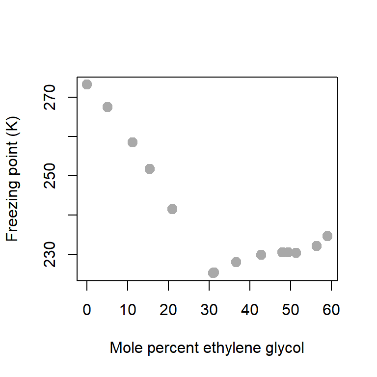
Using the summary function, we can obtain a basic descriptive summary of the variables in the given data set.
summary(data) # basic data summary glycol freezing_point
Min. : 0.00 Min. :225.3
1st Qu.:16.84 1st Qu.:230.0
Median :33.92 Median :231.3
Mean :32.75 Mean :239.9
3rd Qu.:49.01 3rd Qu.:249.2
Max. :59.05 Max. :273.1 10.2 Minimization of the error sum of squares
In the above plot, it is evident that the relationship does not seem to be linear. However, at a starting point, we shall try to fit a linear function of the form \[y = b_0 + b_1 x + e,\] where the parameters \(b_0\) and \(b_1\) are to be estimated from the given data. The term \(e\) denotes the error which typically denotes the different between the observed response and the predicted values obtained by the fitted equation.
Suppose that we denote the response (freezing point) using the symbol \(y\) and Mole percent ethylene glycol is represented using the symbol \(x\). There are \(n = 14\) data points. The expression for the error sum of squares is given by
\[E(b_0,b_1) = \sum_{i=1}^n \left(y_i - b_0 - b_1 x_i\right)^2\] We want to choose values of \(b_0\) and \(b_1\) so that \(E(b_0,b_1)\) is minimized. Let us try to have some visual display of the error sum of squares as a function of \(b_0\) and \(b_1\).
ESS = function(b0,b1){
  return(sum((freezing_point - b0 - b1*glycol)^2))
}
Let us plot the surface with respect to \(b_0\) and \(b_1\).
b0_vals = seq(-100, 300, by = 2)
b1_vals = seq(-100, 300, by = 2)
ESS_vals = matrix(data = NA, nrow = length(b0_vals), ncol = length(b1_vals))
for(i in 1:length(b0_vals)){
  for(j in 1:length(b1_vals)){
    ESS_vals[i,j] = ESS(b0_vals[i], b1_vals[j])
  }
}

library(plot3D)
persp3D(b0_vals, b1_vals, ESS_vals, phi = 20, theta = 120,
      xlab = "b0", ylab = "b1", zlab = "ESS")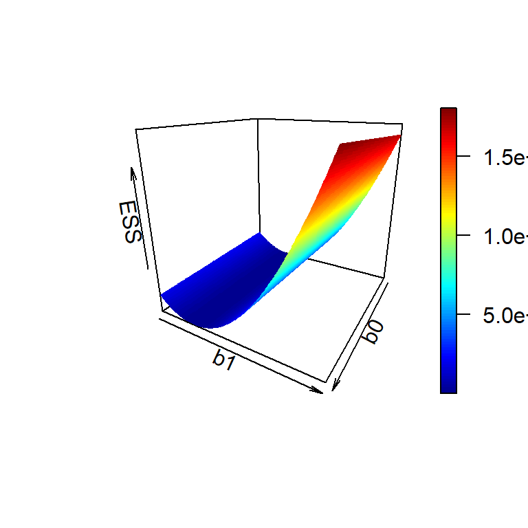
10.2.1 Matrix Notation
We adopt some matrix notation for computation
The response variable \(Y = (y_1,y_2,\ldots,y_n)'\). Therefore, \(Y_{n\times 1}\) is a column vector and \(n\) is the number of rows in the data.
The design matrix \(X\). In this case, we have the predictor variable \(x = (x_1,x_2,\ldots,x_n)'\), a column vector. If the linear equation contains an intercept term \(b_0\), we consider the design matrix as \[X=\begin{pmatrix} 1 & x_1 \\ 1 & x_2 \\ \vdots & \vdots \\ 1 & x_n\end{pmatrix}\]
Parameter vector \(b = (b_0,b_1)'\) which is a \(2\)-dimensional column vector.
The linear model now can be represented as \[Y = Xb\] To find the best choice of \(b\), we need to minimize the error sum of squares with respect to \(b\) and in matrix notation the error sum of squares is given by \[ESS(b) = (Y-Xb)'(Y-Xb)\] We compute \(\frac{\partial }{\partial b}\mbox{ESS}(b)\) and equal to zero which gives the system of linear equations as (in matrix form) \[X'Y = (X'X)b\] If \(\det(X'X)\ne 0\), then the least squares estimate of \(b\) is obtained as \[\widehat{b} = (X'X)^{-1}X'Y\]
Y = freezing_point
X = cbind(rep(1, length(Y)), glycol)
print(X)
glycol
[1,] 1 0.00
[2,] 1 5.09
[3,] 1 11.30
[4,] 1 15.47
[5,] 1 20.94
[6,] 1 30.97
[7,] 1 31.22
[8,] 1 36.62
[9,] 1 42.76
[10,] 1 48.00
[11,] 1 49.34
[12,] 1 51.36
[13,] 1 56.36
[14,] 1 59.05b_hat = (solve(t(X)%*%X))%*%t(X)%*%Y
print(b_hat) [,1]
262.2041053
glycol -0.6796534plot(glycol, freezing_point, type = "p", pch = 19,
col = "darkgrey", xlab = "Mole percent ethylene glycol",
ylab = "Freezing point (K)", cex = 1.4)
curve(b_hat[1]+b_hat[2]*x, add = TRUE, col = "red", lwd = 2)
Y_predicted = X%*%b_hat
points(glycol, Y_predicted, pch = 19,
col = "blue", cex = 1.4)
legend("topright", bty = "n", legend = c("observed", "predicted"),
col = c("darkgrey", "blue"), pch = c(19,19),
cex = c(1.4, 1.4), lwd = 1, lty = c(NA, NA))
# prediction at glycol = 33.3
glycol_star = 33.3
Y_star = b_hat[1]+b_hat[2]*glycol_star
points(glycol_star, Y_star, pch = 18, col = "magenta", cex = 1.5)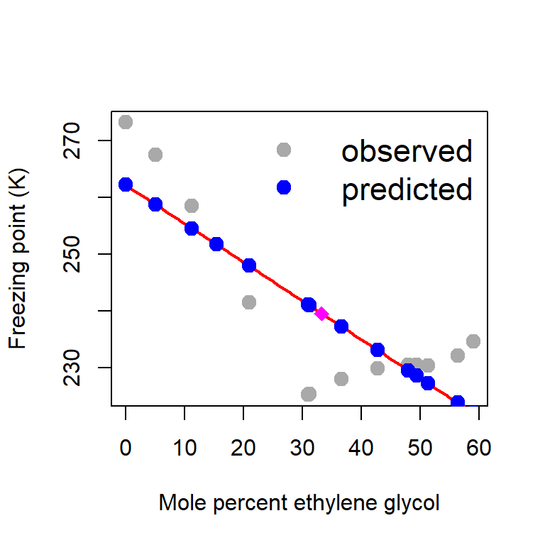
error = Y - Y_predicted # computation of error
ess_hat = sum(error^2)
print(ess_hat)[1] 1080.218par(mfrow = c(1,2))
plot(Y_predicted, error, pch = 19, col = "red",
xlab = expression(widehat(Y)), ylab = expression(widehat(e)))
abline(h = 0, col = "grey", lwd = 2, lty = 2)
hist(error, probability = TRUE, xlab = expression(widehat(e)))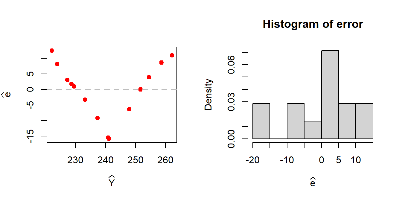
A patterned relationship between the residuals and the fitted values gives an indication of the possible existence of nonlinear relationship between the predictor and the response.
10.2.2 Estimating the parameters using R
fit = lm(glycol ~ freezing_point, data = data)
summary(fit)
Call:
lm(formula = glycol ~ freezing_point, data = data)
Residuals:
Min 1Q Median 3Q Max
-16.4434 -7.4094 -0.0959 6.8410 20.9756
Coefficients:
Estimate Std. Error t value Pr(>|t|)
(Intercept) 272.6694 47.6565 5.722 9.58e-05 ***
freezing_point -0.9999 0.1982 -5.045 0.000287 ***
---
Signif. codes: 0 '***' 0.001 '**' 0.01 '*' 0.05 '.' 0.1 ' ' 1
Residual standard error: 11.51 on 12 degrees of freedom
Multiple R-squared: 0.6796, Adjusted R-squared: 0.6529
F-statistic: 25.45 on 1 and 12 DF, p-value: 0.00028710.3 Least Squares for quadratic function
We consider the fitting of function of the form \[y = b_0 +b_1 x+b_2 x^2 + e.\] We need to minimize the error sum of squares \[\mbox{ESS}(b_0,b_1,b_2)=\sum_{i=1}^n(y_i - b_0 -b_1x_i - b_2x_i^2)^2.\] The design matrix \(X\) is given by \[X = \begin{bmatrix} 1 & x_1 & x_1^2 \\ 1 & x_2 & x_2^2\\ \vdots & \vdots & \vdots \\ 1 & x_n & x_n^2 \end{bmatrix}\] and the parameter vector \(b=(b_0,b_1,b_2)'\).
Y = freezing_point
X = cbind(rep(1, length(Y)), glycol, glycol2 = glycol^2)
print(X) glycol glycol2
[1,] 1 0.00 0.0000
[2,] 1 5.09 25.9081
[3,] 1 11.30 127.6900
[4,] 1 15.47 239.3209
[5,] 1 20.94 438.4836
[6,] 1 30.97 959.1409
[7,] 1 31.22 974.6884
[8,] 1 36.62 1341.0244
[9,] 1 42.76 1828.4176
[10,] 1 48.00 2304.0000
[11,] 1 49.34 2434.4356
[12,] 1 51.36 2637.8496
[13,] 1 56.36 3176.4496
[14,] 1 59.05 3486.9025b_hat = (solve(t(X)%*%X))%*%t(X)%*%Y
cat("Estimated coefficients b0, b1 and b2 are")Estimated coefficients b0, b1 and b2 areprint(b_hat) [,1]
277.47637633
glycol -2.36315724
glycol2 0.02793794plot(glycol, freezing_point, type = "p", pch = 19,
col = "darkgrey", xlab = "Mole percent ethylene glycol",
ylab = "Freezing point (K)", cex = 1.4)
curve(b_hat[1]+b_hat[2]*x + b_hat[3]*x^2,
add = TRUE, col = "red", lwd = 2) # fitted equation
Y_predicted = X%*%b_hat
points(glycol, Y_predicted, pch = 19,
col = "blue", cex = 1.4)
legend("topright", bty = "n", legend = c("observed", "predicted"),
col = c("darkgrey", "blue"), pch = c(19,19),
cex = c(1.4, 1.4), lwd = 1, lty = c(NA, NA))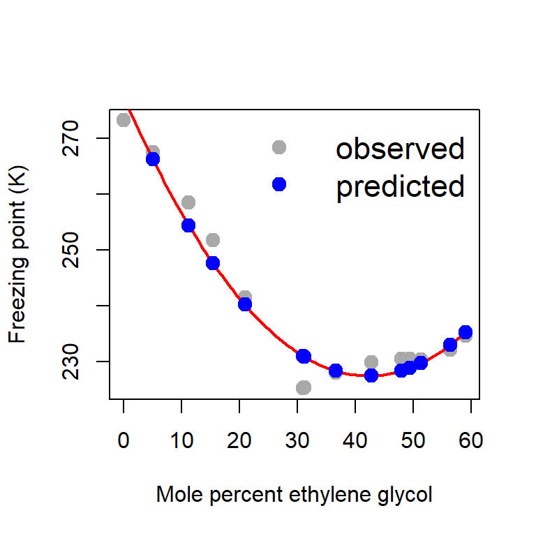
error = Y - Y_predicted # computation of error
ess_hat = sum(error^2) # estimated ESS
print(ess_hat)[1] 134.2652par(mfrow = c(1,2))
plot(Y_predicted, error, pch = 19, col = "red",
xlab = expression(widehat(Y)), ylab = expression(widehat(e)))
abline(h = 0, col = "grey", lwd = 2, lty = 2)
hist(error, probability = TRUE, xlab = expression(widehat(e)))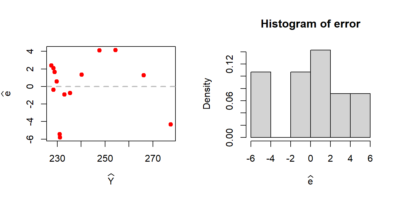
10.4 Least square method for cubic regression
We consider the fitting of function of the form \[y = b_0 +b_1 x+b_2 x^2 + b_3x^3 + e.\]
Y = freezing_point
X = cbind(rep(1, length(Y)), glycol, glycol2 = glycol^2, glycol3 = glycol^3)
print(X) glycol glycol2 glycol3
[1,] 1 0.00 0.0000 0.0000
[2,] 1 5.09 25.9081 131.8722
[3,] 1 11.30 127.6900 1442.8970
[4,] 1 15.47 239.3209 3702.2943
[5,] 1 20.94 438.4836 9181.8466
[6,] 1 30.97 959.1409 29704.5937
[7,] 1 31.22 974.6884 30429.7718
[8,] 1 36.62 1341.0244 49108.3135
[9,] 1 42.76 1828.4176 78183.1366
[10,] 1 48.00 2304.0000 110592.0000
[11,] 1 49.34 2434.4356 120115.0525
[12,] 1 51.36 2637.8496 135479.9555
[13,] 1 56.36 3176.4496 179024.6995
[14,] 1 59.05 3486.9025 205901.5926b_hat = (solve(t(X)%*%X))%*%t(X)%*%Y
cat("Estimated coefficients for b0, b1, b2 and b3 are \n")Estimated coefficients for b0, b1, b2 and b3 are print(b_hat) [,1]
2.760038e+02
glycol -1.985367e+00
glycol2 1.161896e-02
glycol3 1.819175e-04plot(glycol, freezing_point, type = "p", pch = 19,
col = "darkgrey", xlab = "Mole percent ethylene glycol",
ylab = "Freezing point (K)", cex = 1.4)
curve(b_hat[1]+b_hat[2]*x + b_hat[3]*x^2 + b_hat[4]*x^3,
add = TRUE, col = "red", lwd = 2)
Y_predicted = X%*%b_hat
points(glycol, Y_predicted, pch = 19,
col = "blue", cex = 1.4)
legend("topright", bty = "n", legend = c("observed", "predicted"),
col = c("darkgrey", "blue"), pch = c(19,19),
cex = c(1.4, 1.4), lwd = 1, lty = c(NA, NA))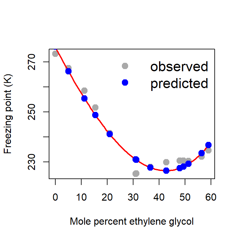
error = Y - Y_predicted # computation of error
ess_hat = sum(error^2)
print(ess_hat)[1] 124.0845par(mfrow = c(1,2))
plot(Y_predicted, error, pch = 19, col = "red",
xlab = expression(widehat(Y)), ylab = expression(widehat(e)))
abline(h = 0, col = "grey", lwd = 2, lty = 2)
hist(error, probability = TRUE, xlab = expression(widehat(e)))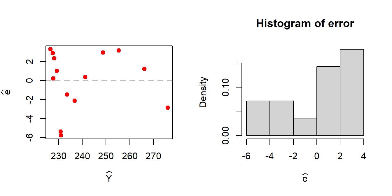
10.5 Case Study (Modelling CO2 Uptake in Grass Plants)
In the above discussions, we have not discussed the statistical properties of the estimators of the parameters for the simple linear regression model. To discuss the statistical properties, we first need to make some assumptions about the distribution of the data, or more precisely the response which is expected to change as a function of the input variable.
We consider the CO2 data set available in the datasets package in R and use a smaller part of the data as demonstration. The CO2 data frame has 84 rows and 5 columns of data from an experiment on the cold tolerance of the grass species . For demonstration we consider only the uptake of one plant at different concentration level.
head(datasets::CO2) Plant Type Treatment conc uptake
1 Qn1 Quebec nonchilled 95 16.0
2 Qn1 Quebec nonchilled 175 30.4
3 Qn1 Quebec nonchilled 250 34.8
4 Qn1 Quebec nonchilled 350 37.2
5 Qn1 Quebec nonchilled 500 35.3
6 Qn1 Quebec nonchilled 675 39.2# help("CO2")
plot(CO2$conc, CO2$uptake, col = "grey",
pch = 19, cex =1.2)
cor(CO2$conc, CO2$uptake)[1] 0.4851774data = CO2[1:21,c("conc", "uptake")]
head(data) conc uptake
1 95 16.0
2 175 30.4
3 250 34.8
4 350 37.2
5 500 35.3
6 675 39.2dim(data)[1] 21 2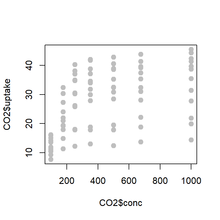
We consider the following statistical model which is given by \[\mbox{uptake}_i | \mbox{conc}_i \sim \mathcal{N}\left(b_0 + b_1\times \mbox{conc}_i, \sigma^2\right)\] and uptake by the plant are different concentration levels are statistically independent. In other words, the distribution of uptake at different concentration are independently normally distributed with constant variance and its expectation varies with the concentration following a linear function.
Write down the likelihood function of for estimating the parameters \(b_0,b_1\) and \(\sigma^2\).
Analytically derive that the likelihood function is maximized at \[b_1^{*} = \frac{S_{xy}}{S_{xx}}, ~~b_0^*=\bar{y}-b_1^{*}\bar{x}, ~~\sigma^{2*}=\frac{1}{n}\sum_{i=1}^n\left(y_i - b_0^{*}-b_1^{*}x_i\right)^2,\] where the notations have their usual meaning.
Using the
optim()function in R, maximize the function and report the estimates.Also report the standard error of the estimators.
The following R codes may be used to compute the estimates.
S_xx = sum((data$conc - mean(data$conc))^2)
S_yy = sum((data$uptake - mean(data$uptake))^2)
S_xy = sum((data$conc - mean(data$conc))*(data$uptake - mean(data$uptake)))
b1_star = S_xy/S_xx
b0_star = mean(data$uptake) - b1_star*mean(data$conc)
sigma2_star = sum((data$uptake - b0_star - b1_star*data$conc)^2)/nrow(data)Using the following R codes, we can draw the fitted line.
plot(data$conc, data$uptake, pch = 19,
col = "red", cex = 1.2)
conc_vals = seq(90, 1010, by = 5) # creating fitted lines
uptake_vals = b0_star + b1_star*conc_vals # predicted uptake values
lines(conc_vals, uptake_vals, lty = 2, col = "blue",
lwd = 3) # add fitted line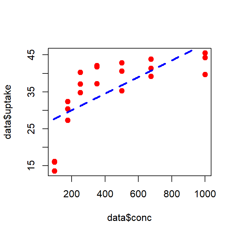
In the following, we check whether the model assumptions are met or not.
par(mfrow = c(1,2))
eps_star = data$uptake - b0_star - b1_star*data$conc # error
hist(eps_star, probability = TRUE,
xlab =expression(widehat(epsilon)), main = " ")
curve(dnorm(x, 0, sd = sqrt(sigma2_star)), col = "red",
lwd = 2, add = TRUE)
# test for normality
shapiro.test(eps_star)
Shapiro-Wilk normality test
data: eps_star
W = 0.92759, p-value = 0.1232plot(data$conc, eps_star, pch = 19, col = "red",
lwd = 2, cex = 1.3, ylab = expression(widehat(epsilon)))
abline(h = 0, lwd = 3, col = "darkgrey", lty = 2)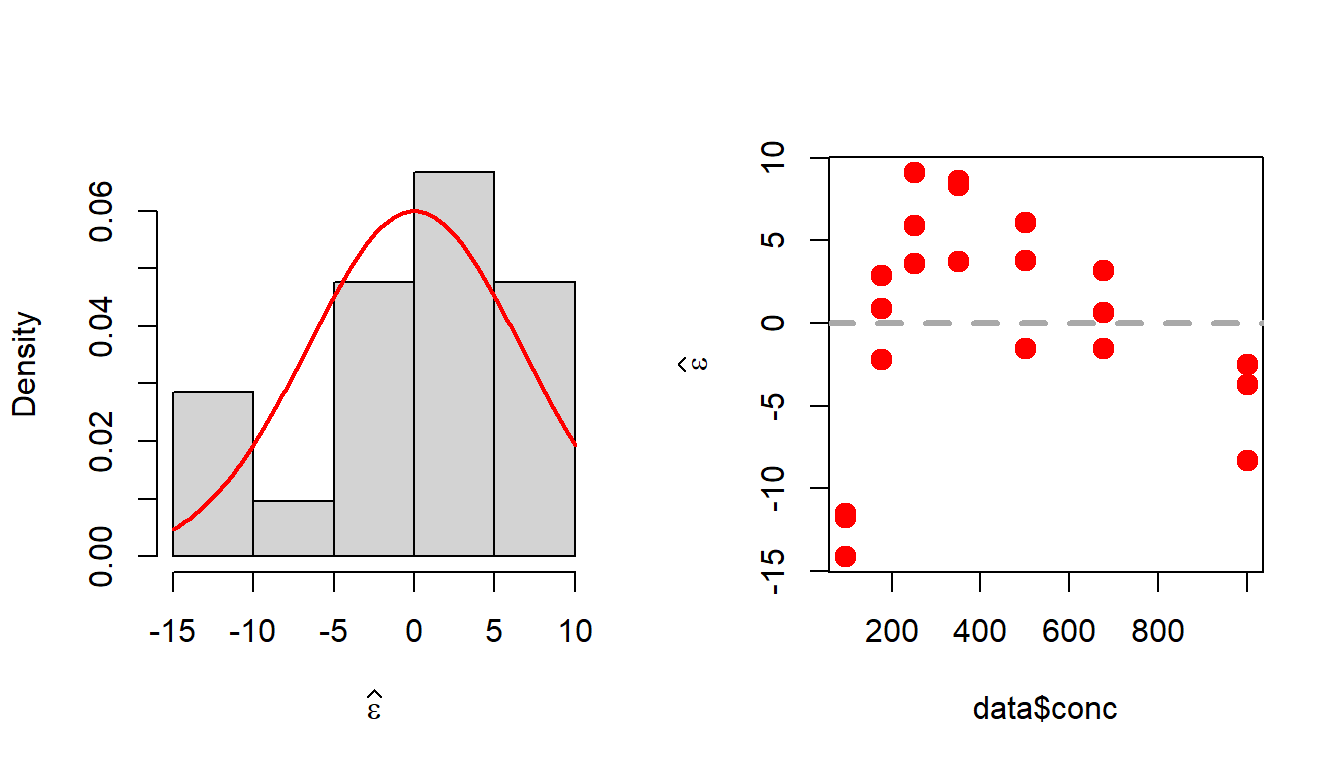
10.6 More case studies
We consider the cars data set.
head(datasets::cars) speed dist
1 4 2
2 4 10
3 7 4
4 7 22
5 8 16
6 9 10# help("cars")
names(cars)[1] "speed" "dist" plot(cars, xlab = "Speed (mph)", ylab = "Stopping distance (ft)",
las = 1, pch = 19, col = "red")
n = nrow(cars) # number of rows
Y = cars$dist # response
# rep(1,n)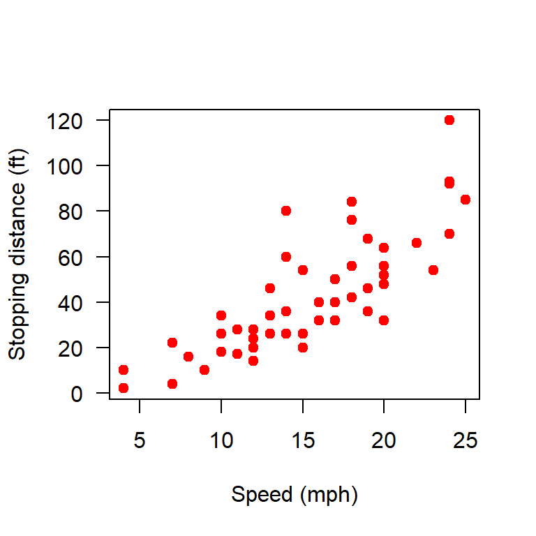
10.6.1 Linear and quadratic regression
In the following R codes, we build the linear and quadratic regression model using matrix notations.
X = matrix(data = c(rep(1,n), cars$speed), nrow = n, ncol = 2)
# print(X)
plot(cars, xlab = "Speed (mph)", ylab = "Stopping distance (ft)",
las = 1, pch = 19, col = "red")
b_hat = (solve(t(X)%*%X))%*%t(X)%*%Y
print(b_hat)
[,1]
[1,] -17.579095
[2,] 3.932409curve(b_hat[1] + b_hat[2]*x, add = TRUE,
col = "blue", lwd = 2)
# quadratic regression
X = matrix(data = c(rep(1,n), cars$speed, cars$speed^2),
nrow = n, ncol = 3)
# print(X)
b_hat = (solve(t(X)%*%X))%*%t(X)%*%Y
print(b_hat) [,1]
[1,] 2.4701378
[2,] 0.9132876
[3,] 0.0999593curve(b_hat[1] + b_hat[2]*x + b_hat[3]*x^2, add = TRUE,
col = "magenta", lwd = 2)
legend("topleft", legend = c("linear", "quadratic"),
lwd = c(2,2), col = c("blue", "magenta"), bty = "n")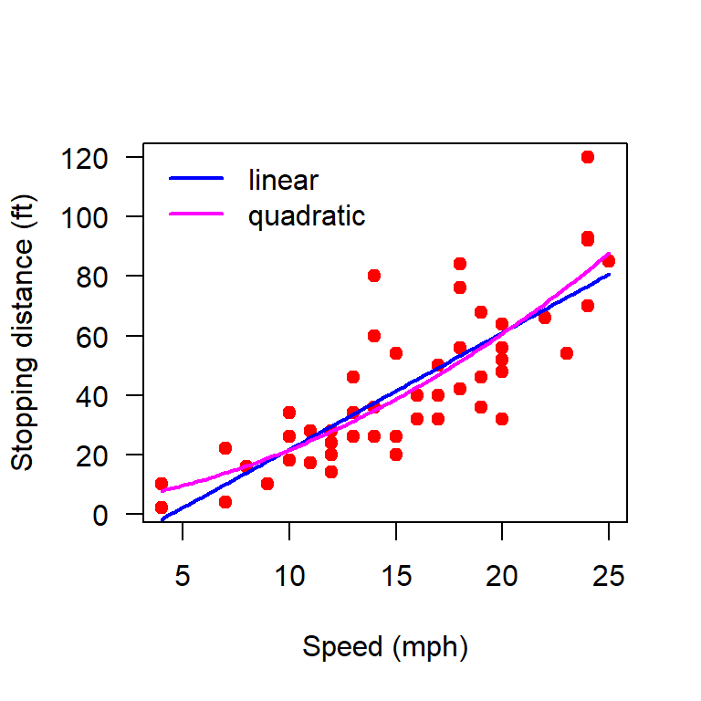
10.6.2 Making predictions
# Making predictions (Linear)
par(mfrow = c(1,2))
plot(cars, xlab = "Speed (mph)", ylab = "Stopping distance (ft)",
     las = 1, pch = 19, col = "red")
X = matrix(data = c(rep(1,n), cars$speed), nrow = n, ncol = 2)
b_hat = (solve(t(X)%*%X))%*%t(X)%*%Y
curve(b_hat[1] + b_hat[2]*x, add = TRUE,
      col = "blue", lwd = 2)
H = X%*%(solve(t(X)%*%X))%*%t(X)      # Projection Matrix
dist_hat = H%*%Y
points(cars$speed, dist_hat, col = "green", pch = 19,
       cex = 1.2)
legend("topleft", legend = c("observed", "predicted"),
       col = c("red", "green"), cex = c(1,1), bty = "n", pch = c(19,19))
e_hat = cars$dist - dist_hat
e_hat = (diag(1, nrow = n) - H)%*%Y
# print(e_hat)

hist(e_hat, probability = TRUE, xlab = "residuals",
     main = "Linear")
shapiro.test(e_hat)
    Shapiro-Wilk normality test

data:  e_hat
W = 0.94509, p-value = 0.02152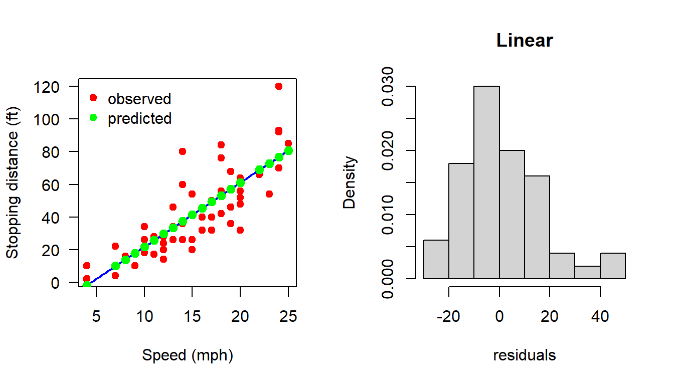
In the following, one can check the properties of the projection matrix \(H\) which are \(H' = H\) and \(H^2=H\).
print(H)
t(H)

H[34,2] == t(H)[34,2]
sum(abs(H - t(H)) < 10^(-3))
sum(abs(H%*%H - H)>10^(-15))
10.6.3 Making predictions (Quadratic)
In the following code, we make the predictions using the quadratic regression model
par(mfrow = c(1,2))
plot(cars, xlab = "Speed (mph)", ylab = "Stopping distance (ft)",
     las = 1, pch = 19, col = "red")
X = matrix(data = c(rep(1,n), cars$speed, cars$speed^2),
           nrow = n, ncol = 3)
b_hat = (solve(t(X)%*%X))%*%t(X)%*%Y
curve(b_hat[1] + b_hat[2]*x + b_hat[3]*x^2, add = TRUE,
      col = "magenta", lwd = 2)
H = X%*%(solve(t(X)%*%X))%*%t(X)     # projection matrix
# print(H)
# t(H)

H[34,2] == t(H)[34,2]
[1] TRUEsum(abs(H - t(H)) < 10^(-3))[1] 2500sum(abs(H%*%H - H)>10^(-15))[1] 57dist_hat = H%*%Y
points(cars$speed, dist_hat, col = "green", pch = 19,
cex = 1.2)
e_hat = cars$dist - dist_hat
e_hat = (diag(1, nrow = n) - H)%*%Y
# print(e_hat)
hist(e_hat, probability = TRUE, xlab = "residuals",
main = "Quadratic")
shapiro.test(e_hat)
    Shapiro-Wilk normality test

data:  e_hat
W = 0.93419, p-value = 0.007988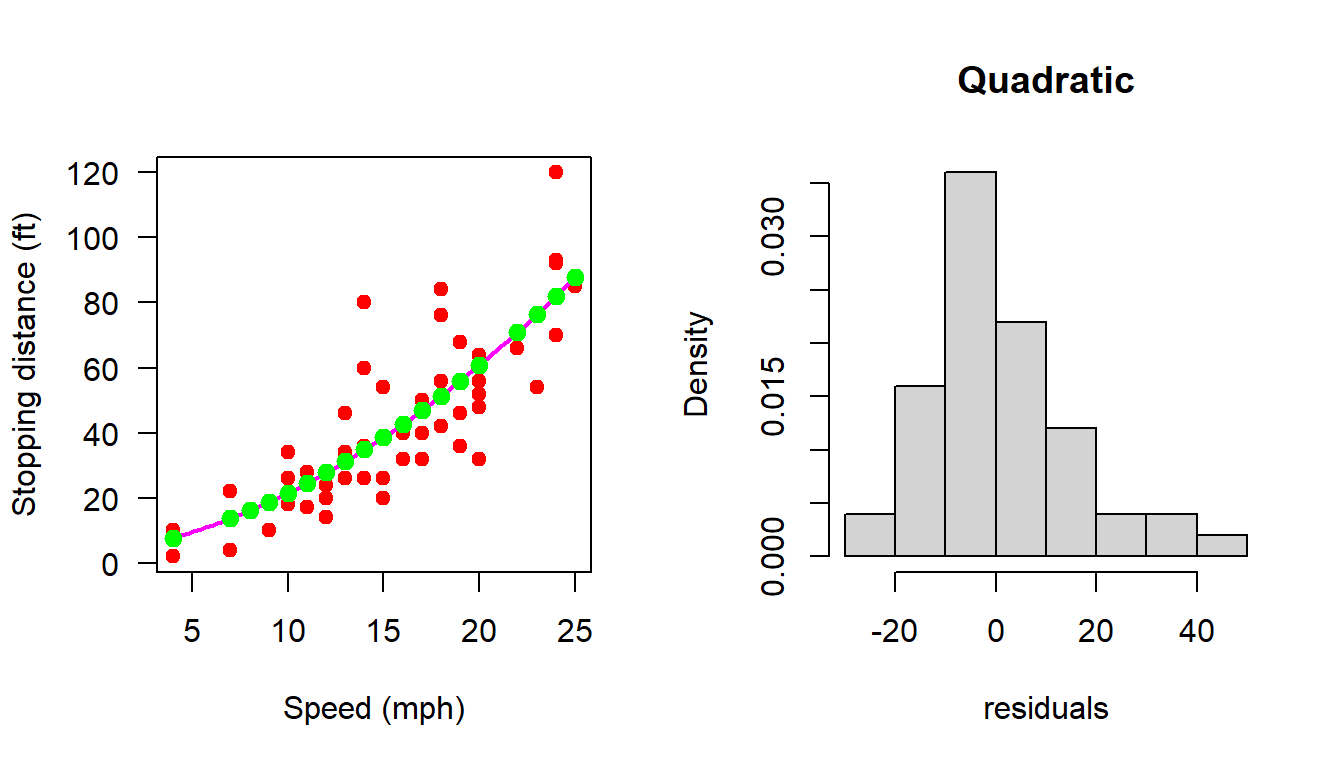
10.6.4 Making predictions (Cubic)
In the following code we use the cubic regression equation to make the predictions.
par(mfrow = c(1,2))
plot(cars, xlab = "Speed (mph)", ylab = "Stopping distance (ft)",
     las = 1, pch = 19, col = "red")
X = matrix(data = c(rep(1,n), cars$speed, cars$speed^2, cars$speed^3),
           nrow = n, ncol = 4)
b_hat = (solve(t(X)%*%X))%*%t(X)%*%Y
curve(b_hat[1] + b_hat[2]*x + b_hat[3]*x^2 + b_hat[4]*x^3,
      add = TRUE, col = "magenta", lwd = 2)
H = X%*%(solve(t(X)%*%X))%*%t(X)

dist_hat = H%*%Y
points(cars$speed, dist_hat, col = "green", pch = 19,
       cex = 1.2)
e_hat = cars$dist - dist_hat
e_hat = (diag(1, nrow = n) - H)%*%Y
# print(e_hat)

hist(e_hat, probability = TRUE, xlab = "residuals",
     main = "Cubic")
shapiro.test(e_hat)
    Shapiro-Wilk normality test

data:  e_hat
W = 0.92868, p-value = 0.004928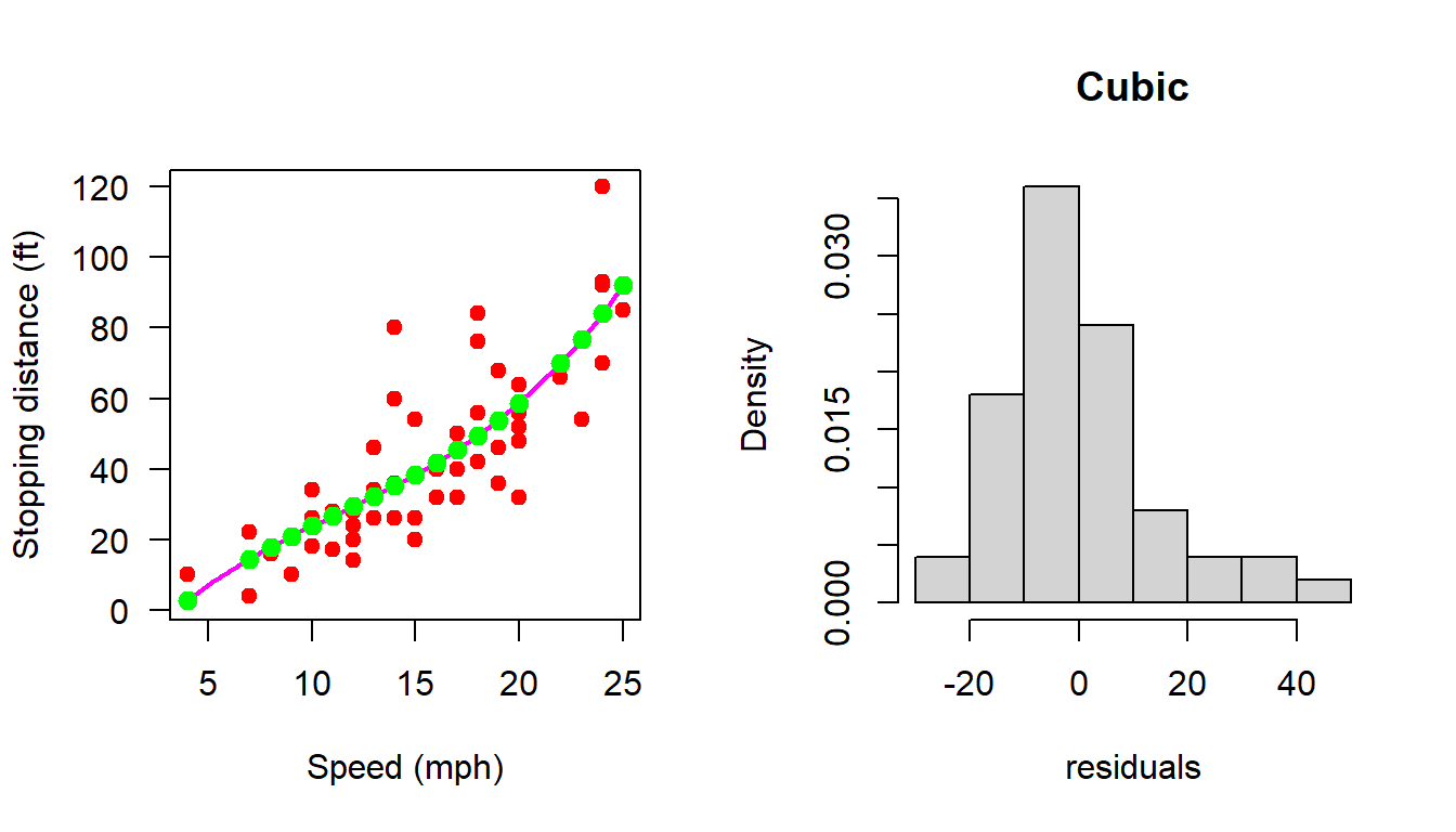
10.6.5 Sensitivity of the estimates
Coming back to the Simple Linear Regression and its dependence on individual data points. We remove the first observation and obtain the estimates of \(b_0\) and \(b_1\) and store it. Then remove the second row from the data set and compute the parameter estimates and store. The same has been done for all the rows and we obtain a total of \(50\) estimates of \(b=(b_0,b_1)'\) and call them as \(b_{0-j}\) and \(b_{1-j}\) for \(j\in \{1,2,\ldots,50\}\).
plot(cars, xlab = "Speed (mph)", ylab = "Stopping distance (ft)",
     las = 1, pch = 19, col = "red")
X = matrix(data = c(rep(1,n), cars$speed), nrow = n, ncol = 2)
b_hat = (solve(t(X)%*%X))%*%t(X)%*%Y
curve(b_hat[1] + b_hat[2]*x, add = TRUE,
      col = "blue", lwd = 2)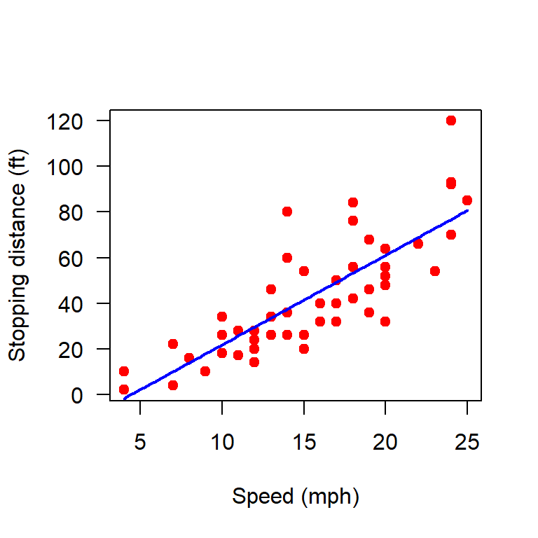
H = X%*%(solve(t(X)%*%X))%*%t(X)

b_hat_j = matrix(data = NA, nrow = n, ncol = 2)
for (j in 1:n) {
  Y_j = Y[-j]
  X_j = X[-j, ]
  H_j = X_j%*%(solve(t(X_j)%*%X_j))%*%t(X_j)
  b_hat_j[j, ] = (solve(t(X_j)%*%X_j))%*%t(X_j)%*%Y_j
}
In the following, we plot the deviations of the estimates of \(b_0\) and \(b_1\) from the original estimates obtained using the whole data set.
par(mfrow = c(1,2))

plot(1:n, b_hat_j[,1], col = "red", pch = 19,
     xlab = "data index", ylab = expression(hat(b[0-j])))
abline(h = b_hat[1], lwd = 3, col = "magenta", lty = 2)
points(49, b_hat_j[49,1], cex = 2, col = "blue", lwd = 2)

plot(1:n, b_hat_j[,2], col = "red", pch = 19,
     xlab = "data index", ylab = expression(hat(b[1-j])))
abline(h = b_hat[2], lwd = 3, col = "magenta", lty = 2)

points(49, b_hat_j[49,2], cex = 2, col = "blue", lwd = 2)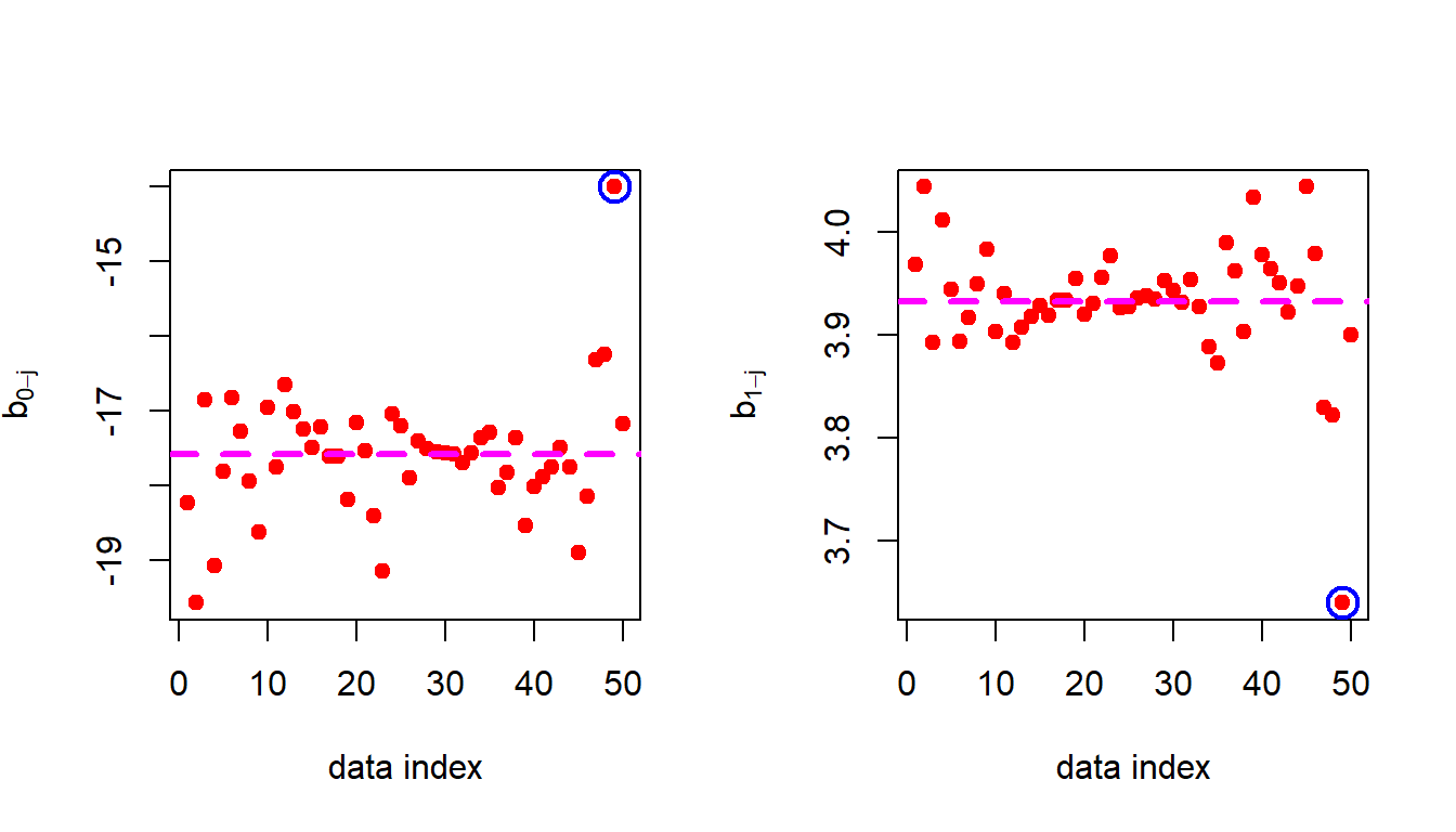
From the above figure it is evident that 49th observation has a very high impact on the fitted regression line. Let us remove it and refit the equations and perform the residual analysis.
10.6.6 Removing 49th observation (the outlier visually)
In the following, we remove the 49th observation manually and check whether
par(mfrow = c(1,2))
plot(cars, xlab = "Speed (mph)", ylab = "Stopping distance (ft)",
     las = 1, pch = 19, col = "red")
points(cars$speed[49], cars$dist[49], pch = 4, lwd = 3)
X = matrix(data = c(rep(1,n), cars$speed), nrow = n, ncol = 2)
X_49 = X[-49, ]
Y_49 = Y[-49]
b_hat_49 = (solve(t(X_49)%*%X_49))%*%t(X_49)%*%Y_49
curve(b_hat_49[1] + b_hat_49[2]*x, add = TRUE,
      col = "blue", lwd = 2)
H_49 = X_49%*%(solve(t(X_49)%*%X_49))%*%t(X_49)
dist_hat_49 = H_49%*%Y_49
points(cars$speed[-49], dist_hat_49, col = "green", pch = 19,
       cex = 1.2)
e_hat_49 = cars$dist[-49] - dist_hat_49
e_hat_49 = (diag(1, nrow = n-1) - H_49)%*%Y_49
# print(e_hat_49)

hist(e_hat_49, probability = TRUE, xlab = "residuals",
     main = "Linear")
shapiro.test(e_hat_49)
    Shapiro-Wilk normality test

data:  e_hat_49
W = 0.95814, p-value = 0.07941
Classroom Quiz: Outlier identification
- Remove the 49th observation from the data set and fit both quadratic and cubic regression equation and check whether the residuals are normally distributed.
- Try to search for some inbuilt functions in R which may be used to identify the outliers.
10.7 Homework Assignment
Homework: Explore individual variables with appropriate plots Boxplot, histogram, vioplots and also check outliers from the boxplots if any. The following codes will be useful for the next step. Also check whether the variables are normally distributed (use \(\texttt{shapiro.test}\)). Make bar plots for the categorical variables. Also make a pie chart wherever appropriate.
library(ISLR)
ISLR::Auto
head(Auto)
names(Auto)
View(Auto)
help("Auto")
dim(Auto)

boxplot(Auto$displacement, main = "Engine displacement (cu. inches)")
help("boxplot")

hist(Auto$displacement, probability = TRUE,
     main = "Engine displacement (cu. inches)")

library(vioplot)
vioplot(Auto$displacement, main = "Engine displacement (cu. inches)")

# Whether the variable is normally distributed
shapiro.test(Auto$displacement)

mean(Auto$displacement)
sd(Auto$displacement)
var(Auto$displacement)
median(Auto$displacement)
library(moments)
skewness(Auto$displacement)

mean((Auto$displacement - mean(Auto$displacement))^3)/(sd(Auto$displacement))^3
# Check in the internet why the difference happend!
class(Auto$displacement)

# Origin (Actually a categorical variable but coded as numeric)
class(Auto$origin)
unique(Auto$origin)
table(Auto$origin)
barplot(table(Auto$origin), main = "Origin", col = "red")


boxplot(Auto$displacement ~ Auto$origin)
# Make this plot more beautiful

pairs(Auto, col = "darkgrey")
help(pairs)   # explor pairs() function

summary(Auto)

# Regression model
plot(mpg ~ displacement, data = Auto, pch = 19,
     col = "darkgrey")
plot(Auto$displacement, Auto$mpg)

# Fit a linear regression and quadratic regression equation and perform
# analysis of the residuals and also find if there is some outliers

# Fit a multiple linear regression with mpg as response and
# displacements and weight as the predictors
10.8 Understanding correlation
In the following we consider four different cases of simulations of observations from two random variables \(X\) and \(Y\). In each of the case, \(X\) and \(Y\) are related or not related in some way. In each case, you can understand on your own how they have been simulated. The following demonstration will help us to understand the formula of the correlation better which is given by \[r = \frac{\sum_{i=1}^{n} (x_i - \bar{x})(y_i - \bar{y})}{\sqrt{\sum_{i=1}^{n} (x_i - \bar{x})^2} \sqrt{\sum_{i=1}^{n} (y_i - \bar{y})^2}}.\] Whether the correlation is positive or negative, it completely depends of the value of the denominator which is a sum of the product of two quantities. Let us investigate it closely.
For each \(i\in\{1,2,\ldots,n\}\), \(x_i>\overline{x}\) or \(x_i<\overline{x}\) and therefore \(x_i - \overline{x}\) will be positive or negative, respectively.
For each \(i\in\{1,2,\ldots,n\}\), \(y_i>\overline{y}\) or \(y_i<\overline{y}\) and therefore \(y_i - \overline{y}\) will be positive or negative, respectively.
Therefore, the sum of the numerator can be expressed into four parts. \[\sum_{i=1}^{n} (x_i - \bar{x})(y_i - \bar{y}) = \sum_{\{i:x_i<\bar{x},y_i<\bar{y}\}} + \sum_{\{i:x_i>\bar{x},y_i<\bar{y}\}} + \sum_{\{i:x_i<\bar{x},y_i>\bar{y}\}} + \sum_{\{i:x_i>\bar{x},y_i>\bar{y}\}}\]
Basically, if we shift the origin to the point \((\bar{x}, \bar{y})\), then the points will be distributed in four regions as demonstrated in Figure 10.18. We consider four cases of data generation process, viz. case - I: \(X\) and \(Y\) are independent; case - II: \(X\) and \(Y\) are negatively correlated; case - III: \(X\) and \(Y\) are positively correlated; case - IV: \(X\) and \(Y\) are negatively correlated. The corresponding R codes are provided in Listing 10.1.
# Case - I
x = rnorm(n = 1000, mean = 0, sd = 1)
y = rnorm(n = 1000, mean = 0, sd = 1)

# Case - II
x = rnorm(n = 1000, mean = 0, sd = 1)
y = -x + rnorm(n = 1000, mean = 0, sd = 1)

# Case - III
x = rnorm(n = 1000, mean = 0, sd = 1)
y = x + rnorm(n = 1000, mean = 0, sd = 1)

# Case - IV
x = rnorm(n = 1000, mean = 0, sd = 1)
y = x^2 + rnorm(n = 1000, mean = 0, sd = 1)
10.8.1 \(X\) and \(Y\) are independent
par(mfrow = c(1,1))
x = rnorm(n = 1000, mean = 0, sd = 1)
y = rnorm(n = 1000, mean = 0, sd = 1)
plot(x,y, pch = 19, col = "darkgrey", xlim = c(-5,5),
     ylim = c(-5,5))
abline(v = mean(x), col = "magenta", lwd = 3)
abline(h = mean(y), col = "magenta", lwd = 3)
text(3.5, 3.5, "I", cex = 1.5)
text(-3.5, 3.5, "II", cex = 1.5)
text(-3.5, -3.5, "III", cex = 1.5)
text(3.5, -3.5, "IV", cex = 1.5)
points(mean(x), mean(y), pch = 19, col = "blue",
       cex = 1.3)
text(4.5, 4.5, "(+,+)", cex = 1.2, col = "blue")
text(-4.5, 4.5, "(-,+)", cex = 1.2, col = "blue")
text(4.5, -4.5, "(+,-)", cex = 1.2, col = "blue")
text(-4.5, -4.5, "(-,-)", cex = 1.2, col = "blue")
cor(x,y)
[1] -0.05243167title(bquote(rho == .(cor(x,y))))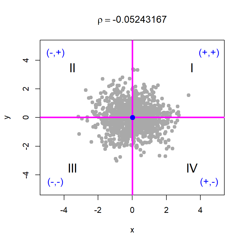
10.8.2 \(X\) and \(Y\) are negatvely correlated
y = -x + rnorm(n = length(x))
plot(x,y, pch = 19, col = "darkgrey", xlim = c(-5,5),
     ylim = c(-5,5))
abline(v = mean(x), col = "magenta", lwd = 3)
abline(h = mean(y), col = "magenta", lwd = 3)
text(3.5, 3.5, "I", cex = 1.5)
text(-3.5, 3.5, "II", cex = 1.5)
text(-3.5, -3.5, "III", cex = 1.5)
text(3.5, -3.5, "IV", cex = 1.5)
points(mean(x), mean(y), pch = 19, col = "blue",
       cex = 1.3)
text(4.5, 4.5, "(+,+)", cex = 1.2, col = "blue")
text(-4.5, 4.5, "(-,+)", cex = 1.2, col = "blue")
text(4.5, -4.5, "(+,-)", cex = 1.2, col = "blue")
text(-4.5, -4.5, "(-,-)", cex = 1.2, col = "blue")
cor(x,y)
[1] -0.7372935title(bquote(rho == .(cor(x,y))))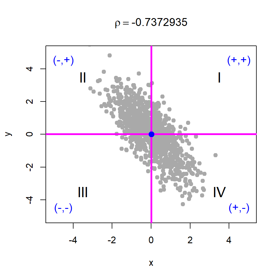
10.8.3 \(X\) and \(Y\) are positively correlated
y = x + rnorm(n = length(x))
plot(x,y, pch = 19, col = "darkgrey", xlim = c(-5,5),
     ylim = c(-5,5))
abline(v = mean(x), col = "magenta", lwd = 3)
abline(h = mean(y), col = "magenta", lwd = 3)
text(3.5, 3.5, "I", cex = 1.5)
text(-3.5, 3.5, "II", cex = 1.5)
text(-3.5, -3.5, "III", cex = 1.5)
text(3.5, -3.5, "IV", cex = 1.5)
points(mean(x), mean(y), pch = 19, col = "blue",
       cex = 1.3)
text(4.5, 4.5, "(+,+)", cex = 1.2, col = "blue")
text(-4.5, 4.5, "(-,+)", cex = 1.2, col = "blue")
text(4.5, -4.5, "(+,-)", cex = 1.2, col = "blue")
text(-4.5, -4.5, "(-,-)", cex = 1.2, col = "blue")
cor(x,y)
[1] 0.694806title(bquote(rho == .(cor(x,y))))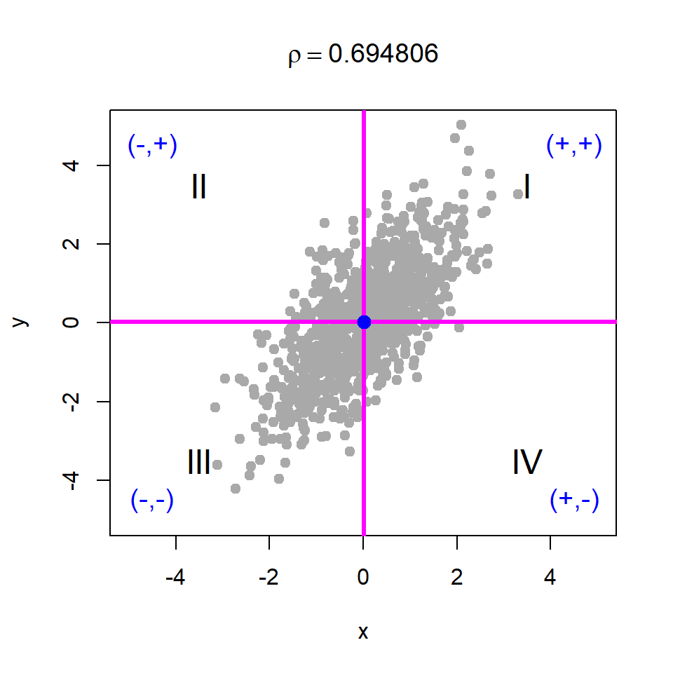
10.8.4 \(X\) and \(Y\) are nonlinearly related
It should be noted that correlation is a measure of the strength of a linear relationship between two variables, which is also evident from the above discussion. Correlation cannot be used to assess independence, as there can be situations where the correlation is zero due to the absence of a linear relationship, even though the variables are nonlinearly dependent. From the graphical exploration using the division of the plane into four regions, we observe that the positive and negative contributions to the product \((x_i - \bar{x})(y_i - \bar{y})\) may cancel each other out in the presence of nonlinear dependence, resulting in a correlation close to zero. The corresponding R codes are given in Listing 10.3 and visual demonstration is given in Figure 10.21.
y = x^2 + rnorm(n = length(x))
plot(x,y, pch = 19, col = "grey",
     xlim = c(min(x), max(x)), ylim = c(min(y), max(y)))
abline(v = mean(x), col = "magenta", lwd = 2)
abline(h = mean(y), col = "magenta", lwd = 2)
points(mean(x), mean(y), col = "blue", cex = 1.4,
       pch = 19)
cor(x,y)
[1] 0.03962659title(bquote(rho == .(cor(x,y))))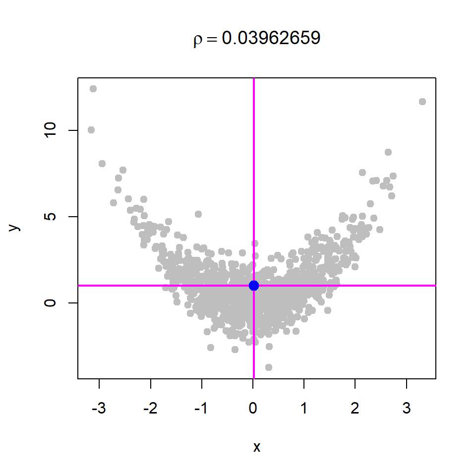
Correlation and Linear Dependence
Therefore, we conclude that correlation measures the linear relationship between two variables. If two variables are independent, their correlation is zero. However, a zero correlation does not necessarily imply independence, as a nonlinear relationship between the variables may still exist.